Sunday, 24 January 2016

Photos Edited


 I am pleased to say that I have needed limited editing to my images (apart from airbrushing) and in fact I have not edited any picture on my contents page. As for the Front Cover (Boy) I only needed to flip the image horizontally, the reason for this was because I had my masthead on the left so if I wanted to maximise cover lines I would struggle with the arm in the way.

As for the DPS, I edited a few parts to make the image more appealing. Firstly I took the head of another photo of my star vehicle as I believed it was more interesting and provocative as she was aiming her face down which looked more serious. Thus, appealing to my target audience as she will be looked up to more. Finally I added nail varnish to the nails which had been chipped, this allowed for a more professional  photo  as it looks like it has been planned prior to the shoot.


Thursday, 21 January 2016

Photoshoot

Reflection on photoshoot:

Here are all of the fesable photos that I came out with on my photoshoot, however I believe I needed to plan my time more effectively to allow for more pictures and of a higher quality.

After a few photos and seeing others taking pictures I realised I needed a white background instead of the black one as this reduce definition in the pictures and didn't look as appealing compared to the white background. In addition to backgrounds I learnt about  lighting and camera work, such things as intensity of the light or the ISO of the camera allowed for changes on the lighting on the subject or how crisp the image was. Little things like this kept my images to a reasonably high standard and therefore will help when making my pages.

So after taking this selection of photos I believe if I had planned who I would like to take the pictures of there attire and also when I took the photos then my outcome of photos would have been of a much higher standard. In addition the higher quality of images would have benefited my magazine pages.


Monday, 11 January 2016

Masthead Design


Here are some Mastheads that popular music magazines have used.  The reason I have chosen these Is due to the fact they are all very simple and not to harsh to the eye. By this I mean that simple techniques have been used to give a effective outcome without much work. I feel that if I can create a successful Masthead then it will appeal better to my target audience, thus meaning it might sell more copies.
After looking at a few Mastheads I have decided that I will create a Masthead much like Billboards but I will use a  different font to make it mine.

My Masthead- As you can see I have put my name of magazine (Unplugged) onto a font website and I have chosen this particular font. I will hopefully use the same font or an alternate that is fairly similar. The reason I like this font is due to the smooth rounded edges which isn't harsh for the older audience whilst it still keeps enough style for my younger audience. In addition I could use a colour on the gaps in the letters to look more like Billboards Font.


Feedback: For this I have asked people within my class and also my parents. This allowed for a wider age range of people to help fit my target audience. From both sets of people there feedback was positive with little to no improvements. Ben- "I really like the modern feel and the simplicity you have gone for, therefore I believe It will match your target audience well."

Parent- "I believe the Masthead is very professional and looks very much like a real music magazine, also if this would be on a Magazine I would be more interested than other boring Mastheads." 

Thursday, 7 January 2016

Photo Planning


For my front cover, I am going to use picture that are similar to these. These pictures are mid shots and wide shots. However they aim in the picture to only uses the body of the person an a limited background. I will use the same technique to get a picture fairly similar, In addition like I said in my Artist profile I might use a different ethnicity like the third one. I will want to use a similar colour palette to these images, although the vary I will choose to to either or.(Bright/subtle)

As for the pose etc, this will be fairly sensible for my front cover and will not relate to much to music, by this I mean I wont use the stereotypical guitar or microphone to show of the music genre. This technique I see as being poorly executed and un professional as the photographer has to use props to show what the image is.

The Double page spread will be quite different from the Front cover in the sense it will be covering two pages and their will be a lot of background to allow for text. This means that for my DPS I will have to choose a good location to shoot or change the background in photoshop to fit the style of the magazine. If I find the correct shoot location I could use a sensible picture with smart attire with a more rustic, ruin like background. However if unsuccessful I will use a more modern style image which has a more vibrant background of a single colour and the outfit will match the style.From here I can use the other image that I believe wont suit the DPS and use this on  the contents page as the main image.

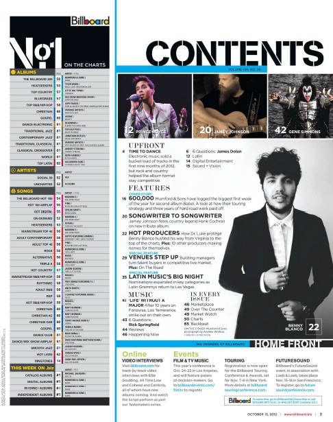
For my Contents page the pictures will be less noticeable so therefore wont be needing as much attention, the images on their will be concert picture and other images that relate to the music theme and might have links with the topics in the pages to come.

These images are some to inspire me for my photoshoot and will be a wide shot to capture the person and the surrounding to cover the two pages that the DPS requires.


Main Artist Profile

I am planning to use either two of the same artists within my magazine or I will use more variation and use different artists throughout. The benefit I believe to doing different artists is the fact that I will be aiming my magazine at the wider audience I am aiming for and also keep people interested in each magazine variant. Meaning that if the Front cover was the same as the DPS the audience would then know without looking through the book what the main topic is about on the DPS, therefore they might not purchase the book.

As for the Subject of my pictures I am planning to use  16-20 year old people who could be either male or female. Although I might not be able the find a person to fit this range, I will still make them look smart and make the picture convey the age range I am aiming for. The ethnicity will white British as most pop magazine have British people within there magazines. In addition the smart dressed people I will also use more modern and up to date artists on my DPS for example. This will show variation in my magazine.


This picture shows Adam Lambert who is fairly popular in America, however the reason I chose this is because it shows how lighting, background and the attire can depict the mood and style of the picture, I will use similar techniques to make my picture follow the nature of my magazine.

Title And Font Notes

Font Notes:

 For my font I will use a large Sans-Serif font which covers the majority of the page and will be the biggest font throughout the magazine. The font I will use will be Arial or LL Brown, this I believe are boring they do show the style of my magazine and keep the clean look I am going for. In addition to this I may decide to use a more unique font for the DPS such as Stencil as this will keep a high appeal to make the magazine more successful.


Title Notes:
As for the name of my magazine I researched through the top magazine publishers and all of there magazines they have connections with and found out what the mastheads tended to be. As a result I found out that most magazine titles/mastheads are short/catchy and can link to the genre or topic in mind such as music. After my research I am going to use the title/name ' Unplugged', this I believe links very well to the music category and is still just inside the length of most mastheads.

My double page spread title is "How I became Famous", I believe this is a very good title due to a big audience like to know the personal side of famous people as they want to be like them one day. For this reason I have titled it to do with how my star vehicle became famous and therefore describing to people the way they could become famous.


This Image shows how the subjects name is in Serif font whereas the important information and cover lines are in a Sans Serif font, like described above. I will hopefully use a mixture of fonts styles like billboard have in there magazines.

Initial Ideas And Institution

For my magazine I have decided to use 'Unplugged' as my title, this is due to the professional nature it takes on and the short catchy style. Furthermore It matches with the music category in the sense that cables are unplugged. This Masthead will be a Big font size and will be Sans-Serif, This will match typical music magazines such as Billboard.

As for content, I will use a range of pop songs/ artists that are either throwback style or the most recent songs/artists  that have been spoken about. As for these artists I will incorporate American and English artists to appeal to the wider audience I aimed for. Following my survey results I will use a majority of pictures and artists surrounded by information that is relevant. This information could be personal life, gossip, tours and interviews etc.


DPS: As for this I will use a very well known artist that could be the same as the front cover or another artist to add variation to the magazine. This DPS will have further more detailed information about their personal life, fame stories and much more, whilst keeping it professional and neat to appeal to my target audience. Within my survey my audience chose to have more subtle colours, this connotes that the theme of my pictures will be smarter and less vibrant. The colour palette will have a majority of darker colours whilst keeping vibrant colours for mastheads etc. This follows on from the two Billboard magazine I am basing mine on.


Institution:


Prometheus Global Media will be my chosen publisher for my magazine due to their fame and use within Billboard who are the magazine style I am basing mine of.

Sunday, 3 January 2016

Sub Genre Codes and Conventions

Front cover:


  • Singular image with the artist who is the main subject of the magazine.
  • New trending artists who have a high popularity.
  • Serif Masthead at the top of the page in a big bold font case, this can be either in the centre or to the left half of the page.
  • Following from the Masthead the cover lines will be the second largest font on the page in a very clear sentence case.
  • Colour palette will be set by the attire of the subject in the image, and will follow this throughout the magazine.
  • The font colour will follow this palette with colours that are easily readable and professional.
  • Small print, price,date and issue number if applicable will be in a corner of the magazine in a small (5-9ppt) font that is just readable.

Contents page:


  • 2-4 images all relating to the contents of the magazine, usually 2-3 of these are of a smaller size with a more major set/ singular image which could relate to the front cover image.
  • Content of the page includes: images of artists that are relevant, topics in magazine, major page links to interesting topics and drama etc.
  • Small sentence case small font which will be a sans-serif font to make it more professional.
  • Again the font colour will be professional and use a black/white colour palette.

Double Page Spread:


  • One main image that is either on the left or right page, however a singular image can cover the two pages with the image being planned so the page fold wont effect the image.
  • The headline differs in the way that it is only on one page to make it easier to read and cant be folded in the centre.
  • Subheading will be of a small font size just underneath the heading so people can understand what it links to.
  • The heading and the subheading will be both serif and sans-serif depending on the design.
  • As for the article font it will be a very small size of 9ppt a as these magazines attract people via the images.
  • The colour palette will be similar to the contents page and will be a black/ white or a colour that fits with the design for the rest of the page.
  • The byline will be in a very small font underneath the heading for the specific article.
  • As for pull quotes these will have a font size in between the article size and subheading size, this can be in a different colour to make it even more noticeable.