Sunday, 30 April 2017
Saturday, 29 April 2017
Friday, 28 April 2017
Final DPS Task:24


Here is my final double-page-spread review page. Looking at the design further their has been slight tweaks from the original flat plans and the draft versions. The key aspect that has changed from the draft is the colour for the background. As discovered from my survey results I have seen that the audience wanted dark colours. However as seen in the draft that didn't turn out successful and wasn't easy to read, for this reason I have gone with a simple, clean and professional white background as i wanted function over design as a key part for the information side of things.
Other slight fixes include Font change, coloured rating system and also I have separated the images to give some clean differentiation between them and also incorporate some of the background so they don't appear over the whole page.
I am very happy with the way my review page has turned out. Initially I was worried about the layout choice and the text content but in the end I am very happy. In terms of the review itself, I wanted to write something which was captivating and gave certain teasers and insights that allowed for a slight description of this film. However, the amount of information given is only enough to allow for the reader to be intrigued and wanting to watch the film. This was a key aspect of the DPS that I was worried about because if I got it wrong it could have meant I either gave away to much making it have a low appeal rate or not giving enough that no one was wanting to see the film. To find out how to perfect it I was always re looking over professional DPS to compare.
In addition to content parts such as colour was key to allowing this review to appear smart, stylish and above all be pleasant to the eye. When looking at such magazines like Little White Lies and Sight and Sound I found out that the colour was mostly muted with key parts or accents being in an alternating colour to break up the page. For this I used Red as my colour of choice, and I believe this worked well. I like the way the colour separates the large amount of text and pull the audience into parts such as the rating system that I have used. This in obviously a major part in many other magazines so I believe the incorporation of it in mine has helped a lot.
A conventional trait of many real life film magazines is the rating system and more in depth information. I ultimately believe I have followed this style and convention to the best of my abilities and this resulted in a professional review page.
Monday, 24 April 2017
Final Poster Task:11

Here is an image of my final poster.
As shown here I haven't actually changed much in the terms of content as asking friends and family, I got all positive feed back with the most common answer being " Any more will be too crowded". However, although unclear here I have in fact gone back into the design and refined any edges along with the proper font and not a screenshot.
Looking at this I can say that I am really happy with the result and I believe that I have linked very well with the film although being subverting. Normally, I would create the poster with a colour such as red to connote the blood. However, looking at Little White Lies they have subverted the ordinary and have come out with a really successful outcome.
For this poster I have focused fully on blue for the main background colour. The reason behind this is because the key part of the film was about the flashing back of Anthony into his past errors that got him into therapy. Looking online the colour blue is a symbol of sadness, remorse, heaven, and memory. All of these parts relate very well to the film and I believe allow this poster to subvert from the norm.
Sadness/Remorse:
How Anthony looks back at his mistakes and realised his wrong doing. The addition of him not wanting to talk about it suggests its a sore subject.
Heaven/ Memory:
This links in with the death of two actors in our film and how they have gone into the dark memories of Anthony.
One aspect that I really like is how I have incorporated the knife into the poster. This is a key part of the film as its the thing that helps Anthony take a fix of drugs and also it is the key element and weapon that results in the killing of both Jessica and Lucy. I have gone with this as my image and not any image of the actors. This is mainly due to the reason the photoshoot wasn't planned and was cut short so the images are of good quality but were not necessarily what I wanted. In addition I wanted to subvert from the ordinary and follow styles of more illustrative movie magazines.
I believe this style and subversion has worked well for my poster and with the knife being a prominent part allows for the viewer to be pulled into the poster wanting to see more of what behind the poster.
Another thing I like about this poster is the 'White Lies' font which I have chosen to show in a cocaine font. This was a lucky find for me as I was looking at normal fonts that are scene on many magazines. However looking down the graphical route I found out that a font was downloadable offline. This is a key part that I believe ties in the poster very well and from the offset you can see that the film is going to incorporate both a knife and Drugs. This works very well at following the style I want and also ups the quality of the final outcome.
Sunday, 23 April 2017
Website

Here is a edit of mine to how our website could look if we were to create one. This would co-inside with the magazine and the name of the website would be Reel Talk. The website would be a subscription based review site that allows people to pay a monthly cost to have the reviews online instead of in paper form. The idea behind this would be to get bigger following and therefor a better name for our selves. As shown here I have put the most recent and trending film (White Lies) as the top main image. This would always be the same but would change on what film it was. At the top of the page their would also be general items that everyone can access to broaden our site viewing. These include:
Movies:
A list of new movies and past movies that we have reviewed. This would have general information, however to gain any more of it and the full review you would have to have a subscription of some kind.
News:
This would be general news that is on the top headlines in the film industry. However in general headlines this wouldn't be covered so our would allowing any one to know were to go for the best up to date information.
Reviews:
This would be the page for just reviews that have been done and the subscription access to them.
Feature:
The main features part would be for any company of film that we believe should be featured and will have a whole page dedicated to it.
Student:
To broaden the audience we would put a section that is purely about student films and experiences that they have told us about in the film industry.
Social:
Finally I would have a part for contacting us to submit or ask questions and also the link to see our social media that would have any other information on.
Draft DPS Task:23


Here is the first draft for my double-page-spread film review page.
Overall I am very happy with the drafts and I believe with a few tweaks I could get this looking very professional. The first thing I have looked at is the headline and logo. I have looked through many fonts but I believe they didn't match the exact style I wanted on their own. To fix this I designed and made the logo for the magazine. The concept behind it is a Reel from a movie camera, this therefore links in with the name of the film and the topic it will be covering. This, although little, help a lot when coming to the final draft.
I also decided to position the text of the review on a one side to allow for an easier read. In addition I believe this fits the typical conventional features of a real-life film magazine, which in tern allows a level of professionalism to be put onto my Double Page Spread.
Putting the red on the page allowed me to ultimately show another colour to keep the audiences interested in reading this page. I have seen certain other designs that appear boring and of low standard due to the fact the page has been one colour.
It's also a way of separating different information such as the main review and the rating system on the page. Intern this means I can use the colour to pull people into the key parts that I want them to know. This allow for another stylistic feature which keeps the page looking fresh and interesting.
Moving on from this draft I will look at creating the same rough layout but tweaking parts such as fonts and colour so the page looks and feels like a high standard film review magazine.
Saturday, 22 April 2017
Editing Process Task:22


Here is the beginning of my editing process.
I wanted to ultimately have a very content and text dense page as I believe it appears in depth and professional for the age group I am primarily aiming my Double Page Spread to. To start of the editing I used the blue lines captured on the last image (rulers) to lay out the page how I intended.
From the Draft DPS I has a rough layout plan and therefore has a rough ideas where the rulers would need to go to divide the page and still fit in all of the information. On the left most part of the page I started by adding the lines into the page as dividers for the key information that was to come next. This along with colour is a well known way of creating neatness and pulling people in.
From here I added my rating system. This would be the part that was prominent in my magazines if I were to create more, it would be a bases to go of when looking at other film reviews. Shown in such websites like Rotten Tomatoes they have a rating system so regular viewer had some base line to go of.
Along with this I added in my logo and film title at the top of the page to start the review like a book as you read from left to right this is what I wanted people to see first. This layout so far will be exactly the same in all other reviews but will be changed dependant on the film and the rating for it ect.
Finally on the page I have added in the text that is extracted from my Draft Article. I have kept all of the information and text the same however I have incorporated it into the layout of the page with multiple text boxes to allow for it to go around the other information.
Friday, 21 April 2017
Equipment List DPS Task:19
I used the following things to create my DPS:
Photography:
Canon 6D DSLRCanon 5d DSLR
SANDISK SDHC 64 GB memory card
Accessories:
Tripod x1
Photography Lights x2
Editing:
Apple iMac Computer
Apple MacBook Pro Laptop
All of these items were key for me to get the best photos I could on the day of the shoot as I needed to get pictures of the actors who were only available for two days.
Photography Lights x2
Editing:
Apple iMac Computer
Apple MacBook Pro Laptop
All of these items were key for me to get the best photos I could on the day of the shoot as I needed to get pictures of the actors who were only available for two days.
As for photos, on set we had two Canon Cameras, for the outcome I actually ended up using the 5d DSLR as the other camera was not available. This was still enough for me the get brilliant photos and actually achieves better quality than the 6d camera.
When it came to capturing the images and getting them onto the computer I used the SanDisk SD card. This was of a big capacity so it was able to store enough photos if any didn't turn out the best.
I had used a tripod to get the best image with the most refined edge. This was because the tripod kept the camera still so their was no movement when taking the photo. If I had taken the photo hand held, when I pressed the the button to take the photo their would have been a slight shake from my hands which could/ would have meant for a rough edge and therefore not the best quality.
The lighting on the set was achieved with photography LED lights, however although I could have changed this for the photo I didn't as it would appear different from the film and therefor un realistic for the style of poster I am looking at.
Finally I used a Imac and Macbook pro for the editing and processing of the imagery. These are very power full machines and they have the correct software such as photoshop that I needed to edit the images.
Photography And Lighting Research Task:18


By looking at tutorials like these it will allow me to expand on my photographic techniques predominantly focusing on lighting techniques how to compose the shot.
From this tutorial I have learnt techniques that I had not previously used. As well as lighting in general and what lights to use, I have actually learnt about the placement of lights to create/ remove shadows . Also, it is explained in the tutorials that maybe natural lighting may be beneficial and would suit the shoot better to create a more realistic mood.
In other tutorials it explains the camera settings regarding ISO, shutter speed and noise reduction, this is another key part to go in connection with lighting to get a better overall result. I however have learnt this previously so I will be focusing on the lighting.
In other tutorials it explains the camera settings regarding ISO, shutter speed and noise reduction, this is another key part to go in connection with lighting to get a better overall result. I however have learnt this previously so I will be focusing on the lighting.
When working on the shoot I found out that the use of artificial light made the shoot seem to unrealistic and therefore didn't match the genre and style we wanted. So after this research I have learnt what makes a professional product but instead used natural lighting which was also spoke about in the tutorials.
DPS Flat Plans Task:17


When designing my flat plans I have looked at other magazines to take inspiration from them. Such magazines include Little White Lies and Sight and Sound. These are magazines that focus on the smaller short films and less mainstream content. This is therefore relevant for my magazine as it features our short film.
For the right design I have used a main lead image to feature on one page with the rest of the page being information about the film and part of the review. For the other page that will take only the majority of the text. I like this design but feel like their isn't many images and it feels fairly disorganised. Due to this I decided to go for the design on the left.
The left design I have taken more inspiration from the magazines and also fixed the mistakes in my other design. On the left of the page it will contain the review along with the information about the film. The extra space from taking the images of this page has allowed for this on one page. In addition to this the whole second page can contain two or more images.
Title Ideas Task:16 (DPS)
Entire Film
Comprehensive Movie
Short Cinema
A-list Mag
Cinematic
Motion
Short Cinema
A-list Mag
Cinematic
Motion
Title Needs:
Quirky name
Short
For a short film mag ?
Film related
Fit genre
Target Audience Approved
Appropriate style for product
Here is a short summary of names that I have thought about for my DPS magazine name. Going down the list you can see that the names all have some sort of relation to the title needs. Before thinking about the possible names I came up with a few key parts that would help me decide on the final name. For example I really wanted the name to be quirky, short and also relate to the film magazine style that I wanted.
Starting of the list I have looked at the broader ideas for names which include; Motion, A-list mag, Comprehensive Movie etc. These were the first names that came to mind, to think of these I ran through the list of 'Needs' and put them with some idea. However after evaluating these few titles, I found them to be fairly boring and also quite childish. For this reason I have thought about 4 more titles shown below that are my short list and match the style that I want better.
Reel Talk
Directors Cut
Focus Pull
Reel View
Theses title to me are much more professionals and show of more of a mature style film magazine. When coming to the outcome and final name I was split between Reel talk and Reel view. The reason for this is because I loved the name 'Reel' as it connotes both a physical reel from an old film camera and how the comments and review in the magazine will be genuine, professional and unbiased (Reel).
For the later part I have decided to choose Talk, the reason behind this is because I saw view as a bit more of an opinion style and not matching to what the magazine would be. Whereas 'talk' suggests that the review would be talking about the film in a more open and professional manner.
This mean that the final name for our/my Magazine will be ' Reel Talk'.
Film Review Notes
Film Review
Features:
Rory Wilton - Protagonist - Anthony
Emma Spurgin Hussey - Wife - Lucy
Ben Hicks - Drug Dealer
Rebecca Meads Stutchbery - Daughter - Jess
Alison Dures - Therapist - TBC
Crew:
Fin Davis - Writer
Ben Hicks - Writer - Actor
Zack Vincent - DOP - Editor - Colour Grade
Jake Clutsom - Producer - Sound
Main Theme:
Thriller
Crime
Drug deal
Murder
Double Homicide
Disjointed chronology
Addict
Filming Quality:
Handheld shows uneasy air
Flash back
Notes:
Location
Arranged location
Correct mise en scene
Right attire
Dim Alleyway
Messy living room, boarded for privacy
Alcohol
Drugs
Knife
Gather Quotes from people who have viewed the film
Release date
Rating
Recommendations
Reviews
Pros
Cons
DPS Survey Task:14


when it comes to a DPS film magazine.
I can gauge from this survey that we have a primarily late teen male audience who are interested in film and want a detailed review about the films if they were to read a magazine. One key point that might change in the end result is the colour. As shown on this survey the audience want a dark themed colour choice. However when designing my DPS I will be also focusing on a professional style and therefore easy to read. This might mean that the background cant be dark as it will be fairly difficult for people to read. To allow for a better match to my target audience whilst keeping it professional I will try to go for a neutral colour scheme.
In terms of theory, Gauntlet said " Media 2.0" which he published in 2007 online, where he stated: "It is hard to define who the "Producers" and who the "Audience" are. This is now allowing the audience, who can access online, are able to become the producers of their own content. This therefore relates to the idea of the review being popular to be published on Facebook.
Analysis of DPS Task:12
Empire:
Empire is a well known film magazine that is published by Bauer Media Group who reach an audience of 22 million adults. Empire is now one of the biggest selling film magazines in the UK, as well as being published in the United Stats, Australia, Turkey, Russia, Italy and Portugal. Empire are now a very big and are a renowned mainstream magazine company that publish reviews on the most popular mainstream films.

Sight And Sound:
This Independent magazine is again a monthly film magazine which is published by the British Film Institute also known as the BFI.
As this magazine is a lot smaller than Empire they tend to focus their attention on a wider genre and type of film compared to Empire who seem to focus on the bigger more popular films. This means that Sight and Sound are ideal for us as they review short films too.

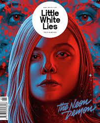
Little White Lies:
Again another Independent magazine who publish Bi-Monthly by the TCO company in London. Similar to Sight and Sound their focus is broader and therefor links to us with our short film. A feature that stands out with this Magazine is the design orientated layout that they follow with the way the design is inspired by each film that they review.

Empire is a well known film magazine that is published by Bauer Media Group who reach an audience of 22 million adults. Empire is now one of the biggest selling film magazines in the UK, as well as being published in the United Stats, Australia, Turkey, Russia, Italy and Portugal. Empire are now a very big and are a renowned mainstream magazine company that publish reviews on the most popular mainstream films.

Sight And Sound:
This Independent magazine is again a monthly film magazine which is published by the British Film Institute also known as the BFI.
As this magazine is a lot smaller than Empire they tend to focus their attention on a wider genre and type of film compared to Empire who seem to focus on the bigger more popular films. This means that Sight and Sound are ideal for us as they review short films too.

Little White Lies:
Again another Independent magazine who publish Bi-Monthly by the TCO company in London. Similar to Sight and Sound their focus is broader and therefor links to us with our short film. A feature that stands out with this Magazine is the design orientated layout that they follow with the way the design is inspired by each film that they review.
Layout:
The simple layout of this page is very clean, smart and professional. The high text to image ratio adds into the effect and make for a older target audience. With the text they have aligned each paragraph, column and row together to allow for neatness along with how the images are perpendicular to the each other and fill the page put nicely.I believe you can see that the style Sight and Sound are going for is very professional, stylistic and modern. Although it could appear quite bland without colour the use of minimal colour to surround elements has created a layout that stands out among others and therefore I would like to follow this style into my DPS.
As for images on the page, I can see that they have gone for a very thought about layout with a set of two equally sized images on the left. With a large image at the top right with the smaller profile photo below. This I can see has been thought about as all of the images fit in nicely to the page with a slight bit of background leaking through to give separation. The use of the bigger image could connote that it is of more importance and would draw the eye of the reader to view that pages. When looking at my design, I will look at image placement but I might look at having images on one page and text on the other for a unique style.
Text Use:
Over the two pages we can see a large amount of text and the ratio lead towards more text than photos. This is most likely aimed at an older audience as that audience like to have a real good, in depth review.Although this could be seen as boring and just text based, I believe in comparison to certain magazines that have all images and just a small amount of text don't support and supply the information to people who want it. Whereas this style covers both need. From this I can say that my magazine review DPS should/will have plenty of text to satisfy the audience and tell them enough about the film. A balanced text to image ratio. ( 50/50 )
Photography Used:
For this page, the images look key to what they are reviewing along with a profile of the critique or similar. Starting from left to right we have a mid shot of the radio which is resting on a table. Along with this it has a dark, gloomy colour so it could suggest a genre of the film they are reviewing. Matching this lighting is the big image, which features a medium long shot of a girl sitting on a bed looking out. The idea that they have focused on mise-en-scene for this image shows me that the images are thought about and that the film might have a certain genre taken from this style of imagery.
The final two shots are of people looking straight into the camera. These are both medium close ups and show a connection between the reader and the person due to the shot type.
Colour Palette:
This DPS has a very limited and restricted colour palette, although its not bland. With the entire page their is just a simple white background and the conventional black text which is seen on a lot of mainstream magazine. This is their to make the page feel both stylish and clean but also provide the best experience for the reader as its very kind to the eye. Pulling away from the neutral is implementation of a warm red tone being used on certain sections. This adds more to the stylish tone but also separates the page and pull the viewer in to specific areas such as the pull quote. This style is very well done and to me makes the page almost more interesting than other magazines that follow a bright colour scheme. For this reason I will also look at creating a magazine DPS that has a small amount of colour in my chosen areas.


Lay-out:
The lay-out of these Little White lies magazines is very professional. The text is laid out very neatly among both magazines and I can see that rulers and guides have been used once again to line each element up. As you can see these pages have gone for a single review per page and a whole DPS for the other review. I will be focusing on the later as that is the style for my magazine review. Looking into the layout the image text ratio is equally split like I spoke about before, however it has the pictures on one side like I wanted. This is very unique and eye catching, I believe the element of this adds style to the page and allows for the reader to be pulled in.
Text Use:
This magazine also follows previous elements of Sight and Sound by incorporating a high amount of text and less images. This appears very professional and keeps to the name of a review page and not a picture book. This photo style is shown a lot in other mainstream magazines and I believe the lack of text really lets down the DPS and lowers the quality. For mine I will look at creating enough text to cover a whole page or their about.
Logo use:
For this specific magazine their is the logo accompanied with the name of the film at the top most part of the left page. This is a nice touch to the magazine and shows the reader what magazine they are reading as well as adding a almost stamp of approval. For example if you were to see this logo on a review you would then know the quality of the review its self.
Colour Palette:
The colour of this magazine is very naturalistic and matches into the style that I want to follow. The charcoal font and slight colour enhancements on key elements allows for a very easy to read and appealing magazine. In addition this adds in a element that allows for a wider age range in the audience to appeal to this magazine instead of like some, having vastly to much colour.
Photography Used:
Again the imagery used for this DPS appears to be very thought after and placed in conjunction with the topic in the text. Although I would say that these images are plucked from the film its self due to the nature of them. However this isn't a bad thing as they are only reviewing a page and not taking the images them selves. This also shows us and the reader and insight into the mise en scene and other aspects of the film. For example if these images were of something totally irrelevant or say the ident for the film then it wouldn't help anyone decide on wether they want to see the film. I will also look at using images that are taken from the film as it could be a good idea to make the magazine seem more professional. Although we could also look at having a individual photoshoot away from the film. In doing this though we will need to concentrate on having continuity between the images and the film.

Unfortunately I misplaced the photos of this review.
The simple layout of this page is very clean, smart and professional. The high text to image ratio adds into the effect and make for a older target audience. With the text they have aligned each paragraph, column and row together to allow for neatness along with how the images are perpendicular to the each other and fill the page put nicely.I believe you can see that the style Sight and Sound are going for is very professional, stylistic and modern. Although it could appear quite bland without colour the use of minimal colour to surround elements has created a layout that stands out among others and therefore I would like to follow this style into my DPS.
As for images on the page, I can see that they have gone for a very thought about layout with a set of two equally sized images on the left. With a large image at the top right with the smaller profile photo below. This I can see has been thought about as all of the images fit in nicely to the page with a slight bit of background leaking through to give separation. The use of the bigger image could connote that it is of more importance and would draw the eye of the reader to view that pages. When looking at my design, I will look at image placement but I might look at having images on one page and text on the other for a unique style.
Text Use:
Over the two pages we can see a large amount of text and the ratio lead towards more text than photos. This is most likely aimed at an older audience as that audience like to have a real good, in depth review.Although this could be seen as boring and just text based, I believe in comparison to certain magazines that have all images and just a small amount of text don't support and supply the information to people who want it. Whereas this style covers both need. From this I can say that my magazine review DPS should/will have plenty of text to satisfy the audience and tell them enough about the film. A balanced text to image ratio. ( 50/50 )
Photography Used:
For this page, the images look key to what they are reviewing along with a profile of the critique or similar. Starting from left to right we have a mid shot of the radio which is resting on a table. Along with this it has a dark, gloomy colour so it could suggest a genre of the film they are reviewing. Matching this lighting is the big image, which features a medium long shot of a girl sitting on a bed looking out. The idea that they have focused on mise-en-scene for this image shows me that the images are thought about and that the film might have a certain genre taken from this style of imagery.
The final two shots are of people looking straight into the camera. These are both medium close ups and show a connection between the reader and the person due to the shot type.
Colour Palette:
This DPS has a very limited and restricted colour palette, although its not bland. With the entire page their is just a simple white background and the conventional black text which is seen on a lot of mainstream magazine. This is their to make the page feel both stylish and clean but also provide the best experience for the reader as its very kind to the eye. Pulling away from the neutral is implementation of a warm red tone being used on certain sections. This adds more to the stylish tone but also separates the page and pull the viewer in to specific areas such as the pull quote. This style is very well done and to me makes the page almost more interesting than other magazines that follow a bright colour scheme. For this reason I will also look at creating a magazine DPS that has a small amount of colour in my chosen areas.


Lay-out:
The lay-out of these Little White lies magazines is very professional. The text is laid out very neatly among both magazines and I can see that rulers and guides have been used once again to line each element up. As you can see these pages have gone for a single review per page and a whole DPS for the other review. I will be focusing on the later as that is the style for my magazine review. Looking into the layout the image text ratio is equally split like I spoke about before, however it has the pictures on one side like I wanted. This is very unique and eye catching, I believe the element of this adds style to the page and allows for the reader to be pulled in.
Text Use:
This magazine also follows previous elements of Sight and Sound by incorporating a high amount of text and less images. This appears very professional and keeps to the name of a review page and not a picture book. This photo style is shown a lot in other mainstream magazines and I believe the lack of text really lets down the DPS and lowers the quality. For mine I will look at creating enough text to cover a whole page or their about.
Logo use:
For this specific magazine their is the logo accompanied with the name of the film at the top most part of the left page. This is a nice touch to the magazine and shows the reader what magazine they are reading as well as adding a almost stamp of approval. For example if you were to see this logo on a review you would then know the quality of the review its self.
Colour Palette:
The colour of this magazine is very naturalistic and matches into the style that I want to follow. The charcoal font and slight colour enhancements on key elements allows for a very easy to read and appealing magazine. In addition this adds in a element that allows for a wider age range in the audience to appeal to this magazine instead of like some, having vastly to much colour.
Photography Used:
Again the imagery used for this DPS appears to be very thought after and placed in conjunction with the topic in the text. Although I would say that these images are plucked from the film its self due to the nature of them. However this isn't a bad thing as they are only reviewing a page and not taking the images them selves. This also shows us and the reader and insight into the mise en scene and other aspects of the film. For example if these images were of something totally irrelevant or say the ident for the film then it wouldn't help anyone decide on wether they want to see the film. I will also look at using images that are taken from the film as it could be a good idea to make the magazine seem more professional. Although we could also look at having a individual photoshoot away from the film. In doing this though we will need to concentrate on having continuity between the images and the film.


Unfortunately I misplaced the photos of this review.
Looking into the review of the mainstreams empire magazines I can see a few areas that are different and similar from the previous magazines I have looked at.
The layout of the page appear fairly professional with a ratio that pleases the eye, however I believe the overall amount of text and images is definitely lacking. The idea of having the image over two pages and text following this appear to me to be more form over function. Although it looks good, I believe it has more of a younger audience pull and the actual review could be seen to have less detail that other magazines. This to me is poor, as they are reviewing a feature film and they are mainstream. In comparison to the Independent magazines that I have looked at I would say they are punching well into the mainstream category with style and function.
As for the text it appears to be fairly small and overwhelmed by the imagery. Although the style and font choice is nice. The fairly big size difference rises a bigger issue of this looking more like and article in a magazine and less like a full blown review. However I do like that they have got a fair amount of text on the page and it would look a lot better with a layout like seen on my previous reviews.
Photo use is again the pictures from the film itself, and discussed before this is not a bad thing. The idea of pulling people in with images that are seen in the film is a good tactic and obviously is working. For this same reason I will use photos that represent the film in the best way and show continuity between image and text. The problem that I have with the images it they way that their is only one image of the film covering the two pages with the other image being totally irrelevant and is actually another film. This isn't the standard that I would expect and I believe it doesn't help tie in the review if the image is no relating and is talking or showing reference about another film.
Finally the colour or lack of in this magazine is surprising but reasonable. I believe generally it appear better with slight colour in the page like seen before but in this case isn't necessary. As the page is blown out with the image which has blue tones to it I believe they are very limited to colour choice and if they were to add anything in could actually appear tacky and too colourful. Although it kind of work and I believe they have made the best of it , I myself wont be following this style as I would like some colour way in my magazine.
Common Conventions of and Practice:13 (DPS)
Typically these Magazine reviews are found in Film magazines such as Sight and sound, however a majority of newspapers such as The Guardian have reviews of films that have done well. These reviews in the newspapers are typically taken from another magazine or from the critic themselves.
Another key place to find reviews are online, such website like Rotten Tomatoes have a huge audience with thousands of views a day. This is due to the vast array of reviews that are compiled over the Internet, therefor their is no need to buy a magazine for each film you want to see the review of.
List of features on a review page :
Tag line to sum up important details about the film.
Summary/rating. Either in a word summary saying if to watch or not or a star rating.
Synopsis of the film
Key/Important/Dramatic photo to pull the audience in to watching the film.
Details; Director,DOP,Sound, Writer etc
Name / Year of the film
Characters / Cast
Name of Critic
I have looked at the BFI magazine sight and side as well as Little White Lies. Looking at theses two magazines I can see that their is a broad difference and totally different style choice to these two magazines. When looking at Sight and Sound I can see that they follow a more professional style and go with the traditional style that is seen on a vast array of other magazines. On the other hand we have Little White Lies who have gone with a more illustrative style which is subverting from the ordinary. However I really like this more unique and niche style as it goes out to the audience and shows that this company is trying and are ending up with a professional style magazine.


This vast style change has led me to believe that I will have free reign on my work and magazine, which will allow me to change my design to a style that I really want and wont have to follow a strict design convention.This means that the audience will be able to see clearly the genre conventions and how I have followed them.

Within the magazines themselves there are codes and conventions that are followed also. For example the graphical style seen in Little White Lies will be followed and continued inside the magazine. This will be used to both improve the continuity of the magazine and promote to the reader what magazine they are reading. In addition to the colour palette and style choice their is also a typography and font conventions that are followed throughout the products.For example both magazine's try to keep a fairly similar style to their font. Whether that be San serif or a serif font and even down to the the character style such as Bold, Italic or Rounded.
In addition to the font choice and colour their is also the key factor of content and what information is provided in the magazine. For example many smaller magazines have certain information that relate to the cast and film company etc. Whereas feature film magazine articles have more technical information as they have bigger budgets and the audience looking at those film will be more interested in that topic.
In addition to the film content for the review, the audience will be a major effect as in the magazine it has to relate the information to the right reader. For example a magazine focusing at the older adults might not want to put information in about the design of the film as the older audience wont always be interested.

Another key place to find reviews are online, such website like Rotten Tomatoes have a huge audience with thousands of views a day. This is due to the vast array of reviews that are compiled over the Internet, therefor their is no need to buy a magazine for each film you want to see the review of.
List of features on a review page :
Tag line to sum up important details about the film.
Summary/rating. Either in a word summary saying if to watch or not or a star rating.
Synopsis of the film
Key/Important/Dramatic photo to pull the audience in to watching the film.
Details; Director,DOP,Sound, Writer etc
Name / Year of the film
Characters / Cast
Name of Critic
I have looked at the BFI magazine sight and side as well as Little White Lies. Looking at theses two magazines I can see that their is a broad difference and totally different style choice to these two magazines. When looking at Sight and Sound I can see that they follow a more professional style and go with the traditional style that is seen on a vast array of other magazines. On the other hand we have Little White Lies who have gone with a more illustrative style which is subverting from the ordinary. However I really like this more unique and niche style as it goes out to the audience and shows that this company is trying and are ending up with a professional style magazine.
This vast style change has led me to believe that I will have free reign on my work and magazine, which will allow me to change my design to a style that I really want and wont have to follow a strict design convention.This means that the audience will be able to see clearly the genre conventions and how I have followed them.
Within the magazines themselves there are codes and conventions that are followed also. For example the graphical style seen in Little White Lies will be followed and continued inside the magazine. This will be used to both improve the continuity of the magazine and promote to the reader what magazine they are reading. In addition to the colour palette and style choice their is also a typography and font conventions that are followed throughout the products.For example both magazine's try to keep a fairly similar style to their font. Whether that be San serif or a serif font and even down to the the character style such as Bold, Italic or Rounded.
In addition to the font choice and colour their is also the key factor of content and what information is provided in the magazine. For example many smaller magazines have certain information that relate to the cast and film company etc. Whereas feature film magazine articles have more technical information as they have bigger budgets and the audience looking at those film will be more interested in that topic.
In addition to the film content for the review, the audience will be a major effect as in the magazine it has to relate the information to the right reader. For example a magazine focusing at the older adults might not want to put information in about the design of the film as the older audience wont always be interested.
Poster Draft 2 Task:10
Overall I am very happy with the outcome of this poster and it follows the conventions and style I was aiming for. By this I mean that I have taken the Illustration format and the birds eye view that I was looking for in my previous research. In addition I believe that this will be the poster I am taking forward as my final version.
Although this has no direct imagery from the film, I have taken photos of items that are in my film. The reason for this is because I wanted to follow a graphical poster such as psycho for my film poster. This is due to the fact I wanted to convey parts of the film with a unique style. Another reason is because it was harder to take good quality images of the actors in the time scale we had.

Although this has no direct imagery from the film, I have taken photos of items that are in my film. The reason for this is because I wanted to follow a graphical poster such as psycho for my film poster. This is due to the fact I wanted to convey parts of the film with a unique style. Another reason is because it was harder to take good quality images of the actors in the time scale we had.
Looking at improvements on this specific draft I would want to make in the future are minimal. However I would like to look at improving the clarity of my edits to allow for a crisp and refined edge. This would drastically improve the outcome and allow for me to resize my imagery without it being distorted and not appealing to the audience.
Finally I might improve the amount of cocaine on the page and the placement. This is because I believe some parts appear quite distracting and I want to share the same amount of items over each third of the page. This will result in a balanced image and not weighing to one side and leaving parts empty.

Editing Poster 2 Task:9
This is my editing process for my second Poster. I have chosen the Dark blue gradient for the background as it relates to the Thriller/ Crime genre we are aiming for with the dark colour. However I have subverted from the typical black as I found that fairly boring and not as punchy and attractive to the audience.Common conventions of a thriller short film poster use predominantly dark, secondary colours to advertise themselves to a specific audience.
I felt as though the gradient of the dark blue to black gave a mysterious note and style that would convey the genre of film to the audience. In addition I have used the birds eye view to convey the coffee table in our film. Although the layout is not in the exact perspective things such as the cocaine appear as they are on a surface and have been cut into the shape of ' White Lies'.
I felt as though the gradient of the dark blue to black gave a mysterious note and style that would convey the genre of film to the audience. In addition I have used the birds eye view to convey the coffee table in our film. Although the layout is not in the exact perspective things such as the cocaine appear as they are on a surface and have been cut into the shape of ' White Lies'.
As shown in this image I have taken a knife and cut it out of a razor blade. Although the razor blade doesn't have much significance with the film, my idea was to link the audience to the genre of the film and with the implementation of these two tools suggest a crime genre.
For the knife this is a simple photo that I have taken of one of my kitchen knifes. From here I have just selected the outline of the shape. Then I have cut out the shape from the razor blade. As for the blade I have done the same but instead of cutting out the blade I have outlined it and put a grey gradient to reduce the reflection.
The knife is the key part to the poster as it is a major part in the film from the cocaine, to cutting the protagonists finger and even the stabbing in the final shot. Overall I am very happy with the implementation of the knife and believe it appears very much like a key part of the film to the audience and connotes a theme or genre.
As for the surrounding font I have used the Helvetica font as it is fairly simple and matches the poster well with less impact on it. As for the Title font I have used a downloadable Cocaine/Powder font as it appears very much like cocaine and takes another key aspect of our film into the poster which I wanted. Finally for the credit font, I have also downloaded the font offline because it was a specialist font that is typically used in many film posters. This was a good choice of mine as it finished the poster of well and If I had chosen any other font it would have been less professional and would appear more student made as such.


Poster Draft Task:10
In conclusion I am very happy with the outcome for a draft and it follows the styles that I was aiming for at the start of my development. By this I mean that I have taken the Illustration format and the birds eye view that I was looking for.
However I do believe that I could vastly improve the poster by refining parts such as the background and developing parts to match the genre of the film. This could include changing the font, colour palette and designs.
My main problem with this poster is the fact that it doesn't have a reflection to show the glass table, this therefore only shows the knife and cocaine and doesn't keep with continuity. To improve this I will look at ways to develop reflections on Photoshop. Therefore It will appear like the table in the film.
The other problem with the poster is the fact that the surrounding areas have no text or credits etc and doesn't appear finished. However this is my first draft so I am extremely happy with the end result and for a first draft I believe I have developed my flat plan into digital poster well.

Editing Process Task:9

Here is my first fairly simple poster draft that is an illustration of the Knife from the drug scene in our Short. I have gathered a screen shot from the film to take reference from to further illustrate. Once I had this knife, my idea was to design the poster from a Birds eye view, this almost shows the view from the Protagonists Point of view when cutting and taking the drugs.

In this screen shot (although faint) I am getting a powder style brush that I have downloaded from brusheezy. This powder style was to replicate the Cocaine as best as possible. I have used a brush for this due to the fact that when I took a photo of the Cocaine it resulted in a jagged cut when trying to remove the background in Photo shop.
This was the same thing with the table, however I found that trying to take a picture of the glass table was very difficult due to the reflections.

To improve this I will attempt to create a reflection in photo shop after looking at some tutorials online.
For the font in this I have used both Futura and Lithos pro. I have not researched these fonts yet to go with the genre of film, however these were just taking from memory of the fonts I liked. In the end I believe that these fonts work well as they have a sharp edge that appears to be cut like the drugs would be.

Finally I outlined the screen shot of the knife in our film and filled it with red. In addition to the knife I used a short stubby brush that I found and manipulated it to appear like it is the Cocaine and has just been cut by the knife.
Journal Of Critical Reflection Task:8
As for my current set of photos, I have a set of photos that are a mixture of screen shots from our cuts and photos that we have taken during the shot.
To fill out our shots and allow us some movement when editing and needing image I have taken screen shots from our film that I would have taken if I had the time with the actor. Unfortunately, our actor was called out for a last minute appointment in London which cut our shoot 1 day short. In this day we could have got a photo shoot done.
Overall I believe this refined set of shots will allow me to design a few posters etc will are up to the quality of other film posters. In addition to this as the shots were taken on the day of the shoot the continuity of the photos works well with the film. I believe that if we could get our actors back for a shoot ( Not possible due to their schedule) it could look out of place as everything from the lighting, clothing and even the camera settings would change which could make for a less professional outcome.
For my poster and other forms of photos I will go with a graphical illustration style, this I believe will allow me to edit the photos how I want them instead of having to work with the image in its current angle. For example If I wanted to Illustrate the knife and cigarette into a single poster I could as they would be of a vector format, Allowing for the images to be manipulated without a loss of quality.
My two favourite images from this shoot are the Cigarette and the cutting of the cocaine. This is due to the fact they connote what the film is about. In comparison from this, the images alone of the actors would not necessarily suggest anything about the film to our audience.
However I believe that I could easily edit the images with surrounding imagery that supports the plot of the film. For example, with the film Shutter Island DiCaprio is seen to be alone on the Island that is underneath him in the poster. This connotes something to do with being on a island maybe alone and lost. With a technique like this I could connect Rory ( Protagonist ) with the drugs and alcohol in the film.
As for ideas, I have had a few in the illustration route in comparison to the photo style. However I will consider this when designing my poster flat plans.
My first Idea is to create a illustrated glass table from a birds eye view. On the table you will see the Drugs, alcohol and Knife, in addition to this you will see out name/masthead cut out of the Cocaine.
Another Idea is to create a illustration like Psycho with the knife and drugs being in a graphical format with a smaller name in a normal font somewhere on the poster.
I will follow up with these design and develop them later in the process.
Original Images Task:20 (Poster)
Here is my 7 images that I have taken that might be needed for the final outcome of my poster.When getting the images I have looked at a multitude of magazine styles and images on poster and have seen that the protagonist or key parts are used in co ordination to the poster. For this reason I have got these key parts of the film and have the photos so I can look at creating the poster.
When deciding on the final image I wanted to use I wanted to follow the themes of Little White Lies magazine, were they are subverting many conventions and are trying to differentiate from any other film magazine. From this I now want to subvert the ordinary and change it up a bit in my poster.
On the idea front I believe I will look at taking the photo of the knife shown here and take the image into Illustrator and try to digital render it so I can then continue making the poster in photoshop. When thinking of the outcome I believe it will be a very illustrated design with the key aspect being the knife and the cocaine in the poster.


Subscribe to:
Comments (Atom)