Pop:


The target audience for a Pop magazine is usually aimed at teenagers. These magazines are also aimed towards younger adults ( 22-33) which is shown from the way Billboard have designed and created there magazine. Billboards magazine are very unique in there layout, all there magazines are presented with a single image of a person on the front. This Image is surrounded with information and puffs. This differs to over magazines such as 'Sugar' who have used the same singular image but its in more of a background setting with a lot of cover lines over crowding the image. This layout and style differences show that 'sugar' is aiming towards the younger audience with the style of imagery and unprofessional layout, whereas 'Billboard' has a more professional vibe which will appeal to a wider range of people. This would suggest that the production value of 'Billboard' would be higher and 'sugar' would have a lower value.
Rock:


The audience profile for Kerrang is a 50/50 split between Male and Female, these genders are shown generally in the age range of 15-24. This varies from Classic Rock where the gender split is similar but the age range is 24-42. The wider range of age and gender is evident in magazines such as 'Kerrang'. This age range is mainly younger adults to teenagers, this is predominately shown by the more modern style music which is less likely to be known by older adults.Further more the more Jumbled Cover lines won't appeal much to older adults who like simple, single photo front. This jumbled Front cover and the fact that younger people will view magazines on the Internet might show that the production value is lower for Kerrang. The majority of Rock magazines follow the same conventions for there colour palette, these colours tend to be White or a bold colour for the cover line. Furthermore the font used for rock magazines tend to be different throughout the magazine, this appeals less to me and the target audience. Kerrang has a lot of promotional puffs for the content of there magazine where Classic Rock is linking more towards the main topics.
Heavy Metal:

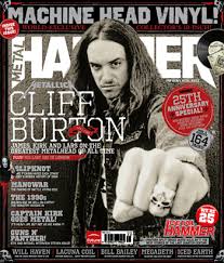
I believe that the heavy metal music genre is aimed at the older target audience as this genre, this is due to the year the songs came out.'Kerrang' and 'Q' are predominantly linked to the older are age, even though some of there content is aimed a younger adults to. Given the fact that these are aimed at the older audience, this could suggest that the production value is lower due to the demand and lack of popularity.The artist who are shown on the front cover are usually related to the heavy metal genre. These artists are popular to allow and pull in interest of the viewers.I dislike the layout of these style of magazines due to the overly crowded page which to me appears unprofessional and doesn't link with other magazines. Further more the amount of artists on the front page and pictures differs a lot from pop magazine where they take on only one to two artist with less photos around the subject. As for colour palette I believe it is less appealing to the target audience due to the dark colours. Although its a heavy metal magazine which link with darker colour their is no brighter backgrounds or bright coloured mastheads which differs to magazines such as Kerrang.
Indie:


The primary target audience for Indie music magazines I believe is from ages 15-30 plus. Indie style music is shown at concerts, this shows its popularity. Furthermore they are growing in popularity every day. This would reflect there production value, I believe that their production value would be low due to the fact their income and fame is from festivals.As for colour palette we can see a more subtle range of colours, some covers have only white or singular colour text. Whereas some like on the right can be seen to have two colour for the text and a different colour like gold is used for the masthead. However comparing to over magazine they highly differentiate which connotes a calm and subtle magazine and audience. This along with the very simple and bland layout with a singular star vehicle connotes that maybe the production value is a lot lower on the magazine side of things. Whereas their concerts have a higher value as that is were their main interest comes from.
Hip/hop and rap:


The target audience of Hip Hop/Rap is popular with the younger audience. This is shown by the popular magazine 'Vibe', who use trending artists that are appealing to the growing teenage audience. Although the style of music differs the layout of the page is very similar to other music magazines like Billboard. Typically their is one artist in a medium close up format in the centre of the page. In addition the colour palette is very bold and inviting, by this I mean that the colours link with each other and the artist. For example the left magazine shows the artist is black and white, therefore the magazine cover lines are white to contrast the black background. As for the yellow this is a random pick of vibrant colours, but it still contrasts well with the darker background palette. As for the magazine on the right, it appears less professional with the colours, however all of the colour are linking with the black,white and green. The red does seem out of place but in fact that is the colour on all of their magazine mastheads. From this I can say that the matching colours and organised layout connotes the magazine will have a higher production value that others and therefore they have more money to improve the magazine and contents within.
No comments:
Post a Comment