Another key place to find reviews are online, such website like Rotten Tomatoes have a huge audience with thousands of views a day. This is due to the vast array of reviews that are compiled over the Internet, therefor their is no need to buy a magazine for each film you want to see the review of.
List of features on a review page :
Tag line to sum up important details about the film.
Summary/rating. Either in a word summary saying if to watch or not or a star rating.
Synopsis of the film
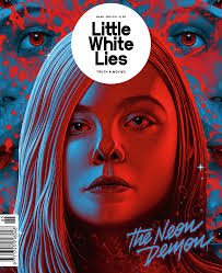
Key/Important/Dramatic photo to pull the audience in to watching the film.
Details; Director,DOP,Sound, Writer etc
Name / Year of the film
Characters / Cast
Name of Critic
I have looked at the BFI magazine sight and side as well as Little White Lies. Looking at theses two magazines I can see that their is a broad difference and totally different style choice to these two magazines. When looking at Sight and Sound I can see that they follow a more professional style and go with the traditional style that is seen on a vast array of other magazines. On the other hand we have Little White Lies who have gone with a more illustrative style which is subverting from the ordinary. However I really like this more unique and niche style as it goes out to the audience and shows that this company is trying and are ending up with a professional style magazine.

This vast style change has led me to believe that I will have free reign on my work and magazine, which will allow me to change my design to a style that I really want and wont have to follow a strict design convention.This means that the audience will be able to see clearly the genre conventions and how I have followed them.

Within the magazines themselves there are codes and conventions that are followed also. For example the graphical style seen in Little White Lies will be followed and continued inside the magazine. This will be used to both improve the continuity of the magazine and promote to the reader what magazine they are reading. In addition to the colour palette and style choice their is also a typography and font conventions that are followed throughout the products.For example both magazine's try to keep a fairly similar style to their font. Whether that be San serif or a serif font and even down to the the character style such as Bold, Italic or Rounded.
In addition to the font choice and colour their is also the key factor of content and what information is provided in the magazine. For example many smaller magazines have certain information that relate to the cast and film company etc. Whereas feature film magazine articles have more technical information as they have bigger budgets and the audience looking at those film will be more interested in that topic.
In addition to the film content for the review, the audience will be a major effect as in the magazine it has to relate the information to the right reader. For example a magazine focusing at the older adults might not want to put information in about the design of the film as the older audience wont always be interested.

proficient research into similar products and a potential target audience.
ReplyDelete