
Tuesday, 29 December 2015


Friday, 11 December 2015
Font Analysis
Font Type:
The majority of Billboards fonts are San-serif. The Only evidence of serif is seen in their logo and sometimes the artists name. This is so that they stand out from the other fonts on the page. This does not make the page look unprofessional or out of place, but instead it makes a change to it in such a subtle way which keeps the magazines live up to their name.
Size of fonts:
Font size can vary throughout the magazine and different magazines. However the font sizes are not random and are used to priorities parts of the page. For example the main part is the masthead, therefor this has the biggest font size and takes up quarter of the page. Following on from that the cover lines and subheadings are fairly small in comparison. They are around 80 Pt's which keeps them looking big compared to the column writing but not as bold as the masthead. As for the column writing this is made barely readable at under 10 Pt's.
Range of fonts:
These varied font sizes are not the same to the amount of fonts on the page. The fonts style will be kept to a minimum and the page will consist of up to 4 fonts, anything above this will look unprofessional and therefore hard to read. The font changes for the masthead, subheadings/ cover lines and column writing, this follows along with the sizes and lays out the page to priorities the parts needed.
Colour of font:
Font colour is varied on different magazines, some can be dark and more subtle whereas more lively magazines are of a brighter colour palette. As for Billboard there magazine are mainly bright colours due to them having the genre of pop, however some of their magazines follow the more subtle colour palette of browns and blacks. I am hoping to be using the less commonly used colours like brown and black to create a multi gendered magazine that has a very professional vibe to it.
Font Style:
Magazines can vary in style, by this I mean the lively magazines or ones that have a younger audience have more ticks on the font ( serif ), this interests the younger audience. However for billboard they use Sans- Serif fonts to be more professional and match the style of their multi gender/ aged audience. As for my magazine I will follow this more professional vibe that billboard takes on due to if being able to match the style of the main image.
Font case:
As for font case the majority of it is sentence case, this means that there are less capitals. This use of capitals are generally limited however some younger audience magazines use them to make the younger audience more interested. This is due to them liking the more lively pages, however for my magazine I will follow a limited font case and less capitals allowing to keep it more professional.


Thursday, 10 December 2015
Target Audience Survey Results

From these results I can see that over 57% of people are males, this however is fairly even to the 42% of females. This further suggests that my idea to have a 50/50 Gender split.

As you can see, the majority of the people are over 16, this allows me to have a more adult style design without it being unappealing to the younger audience.

The majority of people said they would like to have Darker subtle colours over the more vibrant colour palette. In addition to this the Other responses were Black and white, this connotes that people are mainly interested in the darker theme.

From this bar chart I can see that Colour, Artist and pictures are the most common appeal to most people. This means that my magazine will have more pictures and top artists instead of boring information that drowns the pictures.

Although this is not much help to me I can still see that a lot of people are interested in Billboards magazines. This connotes that people like that style and form, intern meaning that my magazine should follow conventions of this magazine.
Thursday, 3 December 2015
Representation and Stereotypes

Gender:
This front cover from the Q magazine supports the theorist Laura Mulvey and her idea of the male gaze. This suggested that women are seen and used as erotic objects of desire, which attract a lot of attention from the male audience.This tactic is used by many media producers to increase their sales and therefore the profit they gain. Its seen within this magazine were Madonna is in small revealing clothing that shows of her bodily features, making males interested by her being sexually attractive.As for my magazine I will not use features that supports Mulvey's theory. The reasoning behind this is due to the fact that my audience is evenly split so therefor I would not want it to appeal to the majority of males.

Race:
Malik said that Black and Asians are stereotypically seen as 'Other' and if they are not White they are not in the Norm. This front cover further adds to the stereotype of Black males with the big shiny jewellery and a fighting pose. Although their is a Black person on this magazine it actually converts from typical conventions were we normally see a white person on the front of a pop magazine. Due to this convention my magazine will use a white person on the front cover. However I might include some Black/ Asian people to still be fair whilst staying with conventions.

Youth:
Here we see Ariana Grande who is a young artist on the front cover on a popular magazine company Billboard. Bill Osgerby links to this image due to the fact he had a theorist on Youth. He said that young people haven't changed much over 100 years and you will not have to search that much to find a bad representation of them. This converts from the theory and the stereotypical teenager, she is in a bright colourful and adventurous in the way that she dresses. As for the media they would see her to be dressed in 'Rough' clothing with trainers. However although this links with the media she is still famous and being seen as an idol by many. Due to my audience having a wide age range, I will more than likely have a teenager within my magazine.

Sexuality:
As shown by this front cover, we can see the bisexual artist lady gaga. However the way she is dressed shows that the theorist Andy Medhurst was correct in his theory. It stated that in the real world we can not see sexuality and we can only tell the sexuality of a person if they were to tell you. Lady Gaga proves this by dressing in a more feminine top and bright pink hair, this make the viewer not able to tell her sexuality without knowing it first. Within my magazine I will Include any gender or sexuality and allow them to dress how they would like and not how the media see them.

National/Regional Identity
Theorist Andrew Higson said "Identity is generally understood to be the shared identity of naturalised inhabitants of a particular political geographic space". By this I can see that its not a British music magazine due to the American flag. Therefor I can see that this magazine would more than likely be related to an American style music magazine. For my magazine I am going to uses National/ Regional identity but I will not emphasise it to the same degree as this magazine. I believe the way the British style will come across will be from the attire of the subject in the cover etc.

My target audience
My target audience will be a mass audience of people who link with the psychographic research I did, this audience will have the save wide age range of 15-30. This defined audience will be a 50% split of both male and female who are all very energetic and love to discover songs, in addition they will be very into music and frequently listen to it either in their free time or whilst working.Social grade C1-E
Gratification theory consists of four categories: Identity, Education, Entertainment and Social interaction.
Identity- Is being able to recognise your role models or the aspiration to be someone else.
Educate- Means that you are able to gather information, understanding and knowledge.
Entertainment- The enjoyment you receive from the media that you are consuming.
Social- Debates, conversations and questions that a media product produces.
Both Identity and Entertainment link to my magazine and audience profile. As for identity it conforms to my magazine and audience due to the people wanting the recognise there role models and aspire to be similar to them. As for Entertainment my audience enjoy to read about their idols and favourite bands.
What have I learnt ?
From my Demographic and Psychographics I have learnt that my audience are quite relaxed and like a variety of songs, however I need to not exceed these boundaries. By this I mean I will not come of topic and genre with the artists and the style when producing the magazine, this will keep the interest like Billboard whilst not making it to specific.
Wednesday, 2 December 2015
Thursday, 26 November 2015
Psychographic Profiling
Pop magazines appeal to 3 Psychographic groups:
Aspirers, Explorers and Reformers.
Aspirers group link to pop music due to them being geared towards fashion and the type of artists within this genre of music.
Explorers are young, energetic and want to seek a variety of songs.
Finally Reformers are free from restrictions and like to explore with no judgements, linking to the non restricted genre.
Pop Magazine Audience Research
We Love Pop:
The majority audience for this magazine is mainly girls who are of the age of 13-15. This audience collates to a reader total of 135,000 and their social class is C1-E. Due to the successful publisher Egmont their circulation figures have hit 42,864 per month.
Top Of The Pops:
Similar to WeLovePop over 3 1/4 of the readers are female, with the age of 11 to 14. However their Reader total is over double the amount at 357,000 people, which brings in 78,352 people every month. Their social class varies from ABC1 and AB.
Billboard:
In contrast to the other 2 the 48,000 people are equally split between females and males. These people are between 20-60 with them being a social class of A-B. 65,308 Circulations per month.
Demographic Target Audience Profile
Genre: Pop
Class: My Primary target audience will be, E within the NRS social grade.
Gender: Evenly split males and females
Age: 15 to 30
Nationality: British
Ethnicity: Any but will be mainly white british
Sexuality:Asexual, Bisexual, Gay, Homosexual and Heterosexual
Audience Appeal: My magazine appeals to people with an interest in current and trending style music/artists.
Analysis of the background of a magazine publisher from my sub-genre
POP:
Billboard
This is some statistics and facts about the Pop Magazine Billboard, this is who I intend to use as my inspiration for my magazine.


Billboard are Primarily published by Prometheus Global Media, these are a well known and successful publisher for magazines. However Egmont and BBC also publish Pop magazine that are of this league.
Billboard
This is some statistics and facts about the Pop Magazine Billboard, this is who I intend to use as my inspiration for my magazine.
Billboard are Primarily published by Prometheus Global Media, these are a well known and successful publisher for magazines. However Egmont and BBC also publish Pop magazine that are of this league.
Friday, 20 November 2015
Differences from online and printed magazines
- Online media is cheaper than printed media in the long run with subscriptions and offers available.
- Online content allows you to interact with the media with links to websites and other content.
- The online magazine will be available on any device with Internet connection and it can be downloaded, this means less space taken up by paper.
- magazines are more commonly advertised in shops which can entice people to buy them.
- These magazines can come with samples within the packaging, this looks appealing to the public due to an extra item for the price of the magazine.
- Magazines can come with a offer to a subscription to the online version which means they get the best of both platforms.
Wednesday, 18 November 2015
Institution Research

Bauer Media Group are Europe's leading and largest publishing group. This group is world wide and privately owned, and majorly successful with over 300 magazines in more than 15 countries. This magazines are not just paper but also cross platform offerings such as Digital, Radio and Television.
This connection of audiences through multi platforms allows for there funding and success with over companies.
Bauer have had connections with many magazines and companies such as Empire, Mcn Sport and Land Rover International. However in linking with Music they have been linked with Kerrang and Q magazines. In addition their Music connections are more popular on the radio and digital side, Such stations include Absolute radio and Kiss. I believe this is due to people listing to the radio in the car from work.
Due to this mass amount of platforms and types the age range from 18 to 55+ of both genders are covered. These might not all be music but this helps to give a good name to their business.
Talking about their audience, For 'Q' they have a total of 377,000 people who watch, listen of read their magazine, With 68.3% of these people being Male and 31.7% of them are Female. In addition to this vastly Male audience they also have a more evenly based target audience within kerrang. Kerrang have a mass audience total of 345,000 with 54.7% of them being male and 45.3% being Females.
Prometheus tries to engage its wide audience much like Bauer with Music, Media and Entertainment. Again they are a leading business and media publisher with more than 1.5 million visitors every month.
In addition to there 5 million monthly page views with 30,000 of these being paid members.
This shows that their online media is vastly more popular to their printed media with 60,000 people reading the magazines.
The reasoning behind the bigger audience online is due to the magazines having a online bonus voucher which allows people to get a free online membership.
Prometheus are based in New York and they have successfully been able to get their media into 82 other countries. This popularity is shown in who they work for, people such as Billboard use Prometheus to gain their mass audiences.


This magazine differentiates to the other two groups as this one is very independent. A digital version of the magazine is also available.The wire has a monthly circulation of 20,000 people and a subscriber database of 9,000 people.
Even though this business is very small in comparison they are still running a profitable business, this is shown by there continual running from 1982 when it was founded. This success hasn't come from many recognisable media groups like Billboard but instead more Gigs,festivals and tours. One company they have published for is DF Concerts and Events.
Thursday, 12 November 2015


My chosen Sub-Genre
I am going to choose a Pop style magazine, this is due to that being one of my favourite styles of music and the one I believe I can best create. I am going to link to Billboard as I prefer their colour palette and the layout they choose. In addition to this I will follow along with the traditional codes and conventions Pop magazines follow.


Wednesday, 4 November 2015
Music Magazine Sub-Genre Research
Pop:


The target audience for a Pop magazine is usually aimed at teenagers. These magazines are also aimed towards younger adults ( 22-33) which is shown from the way Billboard have designed and created there magazine. Billboards magazine are very unique in there layout, all there magazines are presented with a single image of a person on the front. This Image is surrounded with information and puffs. This differs to over magazines such as 'Sugar' who have used the same singular image but its in more of a background setting with a lot of cover lines over crowding the image. This layout and style differences show that 'sugar' is aiming towards the younger audience with the style of imagery and unprofessional layout, whereas 'Billboard' has a more professional vibe which will appeal to a wider range of people. This would suggest that the production value of 'Billboard' would be higher and 'sugar' would have a lower value.
Rock:


The audience profile for Kerrang is a 50/50 split between Male and Female, these genders are shown generally in the age range of 15-24. This varies from Classic Rock where the gender split is similar but the age range is 24-42. The wider range of age and gender is evident in magazines such as 'Kerrang'. This age range is mainly younger adults to teenagers, this is predominately shown by the more modern style music which is less likely to be known by older adults.Further more the more Jumbled Cover lines won't appeal much to older adults who like simple, single photo front. This jumbled Front cover and the fact that younger people will view magazines on the Internet might show that the production value is lower for Kerrang. The majority of Rock magazines follow the same conventions for there colour palette, these colours tend to be White or a bold colour for the cover line. Furthermore the font used for rock magazines tend to be different throughout the magazine, this appeals less to me and the target audience. Kerrang has a lot of promotional puffs for the content of there magazine where Classic Rock is linking more towards the main topics.
Heavy Metal:

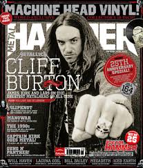
I believe that the heavy metal music genre is aimed at the older target audience as this genre, this is due to the year the songs came out.'Kerrang' and 'Q' are predominantly linked to the older are age, even though some of there content is aimed a younger adults to. Given the fact that these are aimed at the older audience, this could suggest that the production value is lower due to the demand and lack of popularity.The artist who are shown on the front cover are usually related to the heavy metal genre. These artists are popular to allow and pull in interest of the viewers.I dislike the layout of these style of magazines due to the overly crowded page which to me appears unprofessional and doesn't link with other magazines. Further more the amount of artists on the front page and pictures differs a lot from pop magazine where they take on only one to two artist with less photos around the subject. As for colour palette I believe it is less appealing to the target audience due to the dark colours. Although its a heavy metal magazine which link with darker colour their is no brighter backgrounds or bright coloured mastheads which differs to magazines such as Kerrang.
Indie:


The primary target audience for Indie music magazines I believe is from ages 15-30 plus. Indie style music is shown at concerts, this shows its popularity. Furthermore they are growing in popularity every day. This would reflect there production value, I believe that their production value would be low due to the fact their income and fame is from festivals.As for colour palette we can see a more subtle range of colours, some covers have only white or singular colour text. Whereas some like on the right can be seen to have two colour for the text and a different colour like gold is used for the masthead. However comparing to over magazine they highly differentiate which connotes a calm and subtle magazine and audience. This along with the very simple and bland layout with a singular star vehicle connotes that maybe the production value is a lot lower on the magazine side of things. Whereas their concerts have a higher value as that is were their main interest comes from.
Hip/hop and rap:


The target audience of Hip Hop/Rap is popular with the younger audience. This is shown by the popular magazine 'Vibe', who use trending artists that are appealing to the growing teenage audience. Although the style of music differs the layout of the page is very similar to other music magazines like Billboard. Typically their is one artist in a medium close up format in the centre of the page. In addition the colour palette is very bold and inviting, by this I mean that the colours link with each other and the artist. For example the left magazine shows the artist is black and white, therefore the magazine cover lines are white to contrast the black background. As for the yellow this is a random pick of vibrant colours, but it still contrasts well with the darker background palette. As for the magazine on the right, it appears less professional with the colours, however all of the colour are linking with the black,white and green. The red does seem out of place but in fact that is the colour on all of their magazine mastheads. From this I can say that the matching colours and organised layout connotes the magazine will have a higher production value that others and therefore they have more money to improve the magazine and contents within.
Friday, 16 October 2015
Evaluation - Front Cover and Contents Page
Front Cover:
Overall I am very happy with the outcome of my front cover for the College Magazine. I believe the use of the Blue with the contrasting White fonts work very well together. In addition the bright trio of colours for 'Graphics Tutorials' pulls in the viewer and makes the Front cover more interesting.
Pros:
Front cover
Overall I am very happy with the outcome of my front cover for the College Magazine. I believe the use of the Blue with the contrasting White fonts work very well together. In addition the bright trio of colours for 'Graphics Tutorials' pulls in the viewer and makes the Front cover more interesting.
Pros:
- Colours work well together
- Vibrant paint splashes
- Simple yet affective
- Free Membership
Cons:
- Could be more interesting
- Different font for Cover Lines
- More school orientated Picture
Contents Page:
I believe my Contents page has come together quite nicely and has followed on very well from my original Flat plan I did. In addition the slight tweaks I have made I believe are good ones. My favourite part is the contrasting grey margin where I have put the contents of the magazine, this is due the way it separates the page neatly without being too bold.
Pros:
- Effective margin
- Simple yet intuitive
- The images work with the magazine
Cons:
- The images look out of place
- Not much information about the magazine
Peer Evaluation:
Front cover
Pros:
- Nice intuitive Puff
- Clear colour palette
- Picture suits the Task
- Mast head font links with contents
Cons:
- Boring Font for Puff
- Mast head is in two lines
- Free gym membership doesn't fit with context
- Cover lines cover face and come close to edge
Contents Page
Pros:
- Nice grey border
- Continued colour palette
- Font matches mast head
- Good amount of pictures
Cons:
- Need a variety of pictures
- Doesn't link to much with the Front cover


Wednesday, 14 October 2015

This is one of my favourite images I took for the front cover. The reason for this is due to the simple plain effect of a student, furthermore the student looks happy which follows the them of the school.
To use this image I will cut out the student and put a multi gender background colour of Blue or teal. This will be the soul image on my front cover to keep the professional look I am going for.
In addition to this I will crop the image to fit the Mid-shot I need for the task.

This photo is going to be used on the contents page of my magazine, the reason for this is because it shows a student educating themselves with a book from the library. In addition this photo shows the audience the resources people can gather from the school site.

Also this image of the student will also be used on the contents page. This is good due to the student holding an award they have received for a school activity/ subject. In addition it has the graphical background which shows what the school had to offer.

These will be my final 2 images on my contents page. They are both of students working in the mac suite on a subject. The first image is a mid wide angle shot of the students and my second image is of one student in a point of view perspective.

For this image I have focused on the subject and not the work, this allows for a good image whilst not intruding on the work on the computer.
I believe this will further appeal the the graphical inclined students as the picture involves computer works on iMacs. In addition the background is very formal and has students working.
Friday, 9 October 2015
These are my first flat plans I have designed, these will be used to help me design my final magazine. Although these are my concepts, I will hopefully use the same style, Colour palette, font and layout. However during the production of magazine I might realise an alternate font might suit the style I am going for.
For the Front cover I have used a simple grey and cyan colour palette, this is so it can follow my multi gender target audience.
When looking at my survey monkey 25% of people said they liked graphics or art, to incorporate this into my magazine I used a colourful paint splash with an incising offer ' Graphics Tutorials'. In addition to this I added a Free Gym membership voucher to appeal to the 50% of my target audience who voted for sports.


Subscribe to:
Comments (Atom)