Narrative and Representation:
Within a Crime film there is a lot of action. The film will often revolve around the criminal himself or the storyline will follow the criminals victim. Within both styles we can see a lot of fast paced action, unknown storylines and mystery upon what is going to happen next.
For a Thriller there is a climax which ends that story with links throughout the film that adds suspense.Throughout a few Feature Thriller films, I can see a buildup of suspense which is followed by a ultimate climax to the story.
Although both genre's are precent in most Feature films we will try our best to incorporate key aspects into our Short. For example this could mean that we have to write the script in such a way that it builds suspense very quickly to match our 5-10 minute suggested film length.
For characters, I believe we will need 2-4 main character as there can't be to many otherwise they wouldn't fit into our short. However we do need the main protagonist as we need to follow them through the film to add tension and storyline. Furthermore we will need an antagonist to keep this tension building as making the audience on the edge of their seat.
Roland Barthes Stated "The way tension is built up and the audience is left guessing what happens next" (The Enigma) 2007.
This is very relevant to our genre as the idea is to have the audience guessing throughout the film. This is a commonality of thriller/ crime films as their is a progression and the audience are always left guessing.
Media Language:
Within in certain films I can see that long cuts or quick cut shots are the best for adding tension to the film which also gives a sense of urgency to the characters and therefore the audience.
A film famous for keeping the audience on their toes is psycho by Alfred Hitchcock. He uses slow long cuts within the film with his main characters to add tension which builds to the climax of the film. We will be looking at a few films by famous people to decide how we want to build to our film in terms camerawork.
Following on from the Camerawork, Editing is a key part to allow the work you have done in scriptwriting and Camerawork to come together in the final edit. When deciding the camerawork we will be able to all come together and give ideas for editing we have gained from other famous films. However at this point I haven't decided what exact style of editing we want.
Another key aspect is Mise-en-scene, this is important because no matter how good the filming is if we shot the film in a place that opposes our script then it would not be successful. After writing our script we will be able to narrow down each part that we require. In other tense films, they show dark and dull colours to set the scene. Dull colours are used as they are a key part in thrillers that adds tension to the film. We will have to look at this and other parts when setting up.
Sound And Music:
In many thriller films their is a strong tense instrumental sound added to make the atmosphere match the scene. However in other films the lack of music is beneficial as music is not necessary and therefore wouldn't hint to the climax of the film. Personally I find that some lower budget films over use typical songs and music which allows me and the audience to know something is about to happen.
In addition to this the lack of music and the silence within the cinema etc gives a sense of unexpectedness to whats going to happen. Due to this I believe that music although beneficial if used right wouldn't be necessary to make our film better. Another fact is that our film is short, therefor the time of the music would have to be perfect to match the pace of the film. From this I can tell that we will need to research and experiment further down the line with music in our short. This will come later which is good as it will allow us to further build upon our script without this wall in the way.
Friday, 4 November 2016
Thursday, 3 November 2016
BBFC Classification
This is the official classification criteria for a 15 rated film, due to our survey getting results that suggests that the majority of out target audience are aged 15 and above.
Discrimination:
The work as a whole must not endorse discriminatory language or behaviour, although there may be racist, homophobic or other discriminatory themes and language.
Drugs:
Drug taking may be shown but the work as a whole must not promote or encourage drug misuse (for example, through instructional detail). The misuse of easily accessible and highly dangerous substances (for example, aerosols or solvents) is unlikely to be acceptable.
Imitable behaviour:
Dangerous behaviour (for example, hanging, suicide and self-harming) should not dwell on detail which could be copied. Whether the depiction of easily accessible weapons is acceptable will depend on factors such as realism, context and setting.
Language:
There may be strong language. Very strong language may be permitted, depending on the manner in which it is used, who is using the language, its frequency within the work as a whole and any special contextual justification.
Nudity:
There are no constraints on nudity in a non-sexual or educational context. There may be nudity in a sexual context but usually without strong detail.
Sex:
Sexual activity may be portrayed, but usually without strong detail. There may be strong verbal references to sexual behaviour, but the strongest references are unlikely to be acceptable unless justified by context. Works whose primary purpose is sexual arousal or stimulation are unlikely to be acceptable.
Although this is the official classification for feature length films, it still applies exactly the same for short films.
Target Audience Research
With research into other Target Audience's I have come up with a few key points I need to consider.
Age: Older Teenagers to Young Adults. (Borderline)
Gender: Predominately Male
Race: Predominately White but not specific
Religion: Atheist - Again not specific
Sexuality: Predominately Straight
In our first Survey Monkey quiz we asked for peoples age group, From this we got a leading vote for 16 - 20 year olds. Following this was 21-25, this has enabled us to decide what content would/could be in our film and wether we rate it 15 or higher which would then cut of people younger than 18.To help us with this we will look at the BBFC's criteria for a film rating so we can then depict the classification for ours.
For the next question we asked 'What would be a good length for a short Film?'. From this the leading answer was 5-10 minutes, this is great because I believe a short film should be no longer than 10 minutes as then it might be classified as something different. From this question we can now take time to write the script that matches the criteria to keep the film short. In addition to film length, this question will enable us to predict the time allocated for filming, booking equipment and getting actors that might have a busy schedule.
In our next question we asked ' What is your favourite film genre?'. Since our script writers (Fin/Ben) had some ideas on what short film genre they wanted ( Thriller) we were hoping that our target audience survey would relay information that would be in the same style/genre otherwise it would be more difficult to create a script. Within the survey we got a high rating for Thriller, which I believe would be matching the stereotypes of our age group as they are seeking excitement from a film. In addition to this a close second was Crime, which is good as it fairly similar to Thriller but now it allows us to go ahead with a script with parts that link to crime.
A more general question in our survey was about Gender. This came out to be a very close match with Male leading with 52% of the responses. We were planning to to a mix Gender film when we had the initial thought to produce a film so these results are very helpful as they are quite even. When planning this film and writing the script we will have to think about what key parts will make our film mixed Gender's. For example we will see about getting an equal amount of Men to Females within our film.
For our social band question we got a result with the highest vote being from a C1 social grade which means that they are ' Supervisory , Clerical, and Junior Managerial, Administrative and Professional Occupations. In simple terms this means our audience is from a Working Class or Middle Class population.
Finally we asked 'What themes would put you of a film?'. We did this question as it will allow us to plan our script in a way that matches the audience and the BBFC classification. In addition to this we asked about what put them of, we did this because if we asked what they liked it would be a very broad set of results and therefore wouldn't help us. However, by asking what they didn't like such as Blood, Violence or Swearing it would and has produced a narrower range of answers.
Most people responded to this with ' They don't mind as long as it is used appropriately'. This is very understandable and therefore when writing the script we will see if any of the suggested violence would be necessary.


Thursday, 22 September 2016
Short Film Analysis
Jet: Award Winning Short Thriller - Jordan Chesney
Info: A man at his lowest has the opportunity to save a Girl kidnapped from the Curbside.
Time - 7 Mins 45 Sec
Rating - 6.8/10
Date - 1st May 2013
Budget - $10,000
https://vimeo.com/53568239
Jet is an unfortunate man whose best-laid plans are foiled by a little girl. Caught up in the middle of a disturbing crime, will he be able to save the little girl's life, and his own, or will his decisions destroy them both?
A key factor to this film that was very interesting was the lack of Dialogue, although this diverts form typical conventions. I believe this was very clever as Chesney has produced a film that most can understand with no one speaking. However, If this would become a Feature film I would prefer dialogue as it would eliminate depth to the film if not used. For example, Why is the protagonist attempting suicide, Why this location and What is the reasoning for the well dressed men taking the girl to a luxury house ?
For the opening scene, the facial close ups followed by the wide shot from the back of the truck convey the torment the protagonist is going through. From here we carry on with the wide shot when the girl comes into shot, this follow with a facial close up with the protagonist dropping his gun. This connotes that the man could have been going through some stress which relates to a child etc. The technique used which is somewhat POV gives a real sense of emotions that the Protagonist may be going through and therefore adds to the film.
Sound and Music was provided by Neil Degraide. The music throughout this adds real suspense to the film and keeps adding to the events that are happening, Thereby following on with the Thriller conventions.
For this film their is no Age Classification that I can find, However due to the small amount of less detailed violence and the unsuccessful suicide I would classify this film as a 12A or at max a 15.

Soft: Sundance Winner Tense Drama - Simon Ellis
Info: Father and Son tormented by a Gang of 'Happy-Slapping' `Youths.
Time - 14 Mins 10 Sec
Rating - 7.3/10
Date - 20th April 2007
Budget - $50,000
A father and son are independently terrorised by the same gang of youths. The father if forced to deal with fears he hasn’t faced since leaving school. Rediscovering his fear of confrontation.
Soft has won many awards at festivals including Sundance film festival; Palm Springs International Film Festival and the British Independent Film Awards. The budget was £50k.
There is no rating but there is strong language and nudity in a non-sexual context. From this I would rate this at 15 of higher due to its slightly child unfriendly content.
As for the Actors we can see that the Child and Dad have been abused by the same group and are both afraid of them. For the Child we can see that he doesn't like the abuse and goes to the Dad in the hope he will be able to sort it out. However due to the abuse, the Dad just wants it all to end as he isn't physically/mentally strong enough to fix the scenario.
Music is sparse but Rock music is emerging from the son’s bedroom, adding to the sense of forthcoming violence from the bullies.
The majority of the film is professionally shot, however some shots have been incorporated to look like they are shot on a handheld device or phone. I can tell this due to the shaky, cropped footage that is of a lower quality than the rest of the film. This although not professional, it adds to the film to show the street style and the fact the bullies are most likely going to share the footage on social media. This therefor links with stereotypes and conventions with this generation.
The images are stereotypes of trouble making young people who hang outside local shops with track-suits, flat caps and Branded footwear. The father on the other hand seems to be from a traditional working class family who could have been married previously. This is shown from his Clothing and where is house is located.
The target audience would seem to be young people and access would probably be primarily via the Internet on sites such as YouTube and Short of the Week. I can see that it would be for the younger audience as they could be experiencing Bullying and therefore they would/ could find it online.
Due to the popularity of the film, we can see that the use of the phone shot can be seen to show a difference in perspective and matches stereotypes.

The Guilt: Your Film Festival Winner - David Victori
Info: After the murder of Leo's wife a single idea circles endlessly within his head: Revenge
Time -12 Mins 51 Sec
Rating - 7/10
Date - 8th October 2010
Budget - $60,000

The Guilt is a Spanish short film which is based upon a person looking for revenge after the murder of the protagonist's wife.
This films is the combination a multiple complex and unique shots that portray the style and aesthetic the production crew are/were going for. With this infinity, illusion staircase amazingly show the audience the portrayal of time and also the small yellow lit area falling at the bottom of the staircase. With the outline of the protagonist, Leo, standing in the warm lit area we can see that dynamic style and ambition is a key part to this film. The dull, mysterious and gloomy scene presents us with the ideas danger and problems may be to come in this short.

This is a clever implementation of a hint to this short as this word translates into 'fifth' which is the floor number but also links in to a key part of the film in its later stages. Unknowing to the viewer this cold blue colour and theme is a hint of whats to come in this tense packed short.
A part that catches my attention was the acting. Typically the short films I have seen apart from these 3 have has appalling actors as the budget is fairly low to get any professional. However this short has been able to combine the style of camera work and excellent actors to produce such a good film. The protagonist played by Carlus Fabrega, is a challenging and intense role. However the way he brings the character to life and produces effects and emotions that would be seen in many feature films.

In this scene we can see that the continuity between the yellow tone here and the staircase could be purposeful. Here we can see that the protagonist is leaving his wife and that appears as his emotional love and comfort. When it transitions into the staircase we can see the same yellow tone and the protagonist standing their.
With him looking up the dingy, cold blue staircase it suggests that he is now leaving his comfort and going to do something bad or regretful. The killer of Leo wife is at the top of the staircase, when seeing the mise en scene we can see that the production crew have looked into making the killer be dressed like the staircase. This is shown by the blue attire and the cold coloured room.
Overall we can see that the staircase is a main part of the film and it represents a painful, guilt journey that Leo has taken.
This is the best short film I personally have ever seen so far. The acting and production quality is of really hight quality and I wouldn't say it was created by such a small company.
Initial Ideas
After looking deeper into Short films and films in general I have found out many interesting facts and concepts that would help create a better film.
When looking at target audience we originally wanted our film to appeal to everyone to get the most interest. However from research I have found that the older generation will not be very interested in our short film. The reasoning behind this is because our genre (depicted from survey results) is Triller / Crime which is commonly appealing to the younger people as they want action packed scenes/ films.
When looking at target audience we originally wanted our film to appeal to everyone to get the most interest. However from research I have found that the older generation will not be very interested in our short film. The reasoning behind this is because our genre (depicted from survey results) is Triller / Crime which is commonly appealing to the younger people as they want action packed scenes/ films.
Another factor is style, as we are producing a short film we need to show of a wide range of talents to keep people intrigued into our films. We have chosen short films as the amount of work is considerably less than a feature film for example. This will help us concentrate and use more of our skills in the time frame we have. Hopefully by creating a good short if we were to enter a film competition we would have a better chance of being recognised.
From this I can tell that in depth research will allow us to have a good understanding of what audience want and strive for in a film.
Technology Advancements
During the last 10 years the refinement and advances in technology have meant that companies with a lower budget and consumers them selves can access equipment that was only accessible by Hollywood film companies. With advancements such as DSLR'S and CGI, a variety of smaller teams are releasing Cinema grade feature Films.
Other advancements have seen the production process to be dramatically shortened with equipment such as the Mill Blackbird. This is a moving car chassis that can have a wide range of aspects changed such as the width and suspension with a flick of a button. After this software can manipulate a body of any vehicle onto the chassis to create a Car without having the real car there.
For our film we will try to use a selection of cameras; Canon 5d mk3, Canon 6d or Panasonic Gh4. These range from 1080p recording all the way up to 4k. Advancements in these DSLR's means that the common still camera can shoot stunning video and then transferred to a computer via SD card. This is unheard of in past year as the camera equipment only had the capability of recording onto film which couldn't be easily transferred and edited.
As for editing, advance software has took over from Film splicing and is now commonly available for a reasonably high cost. However, the Imac's we hope to use in the editing process have software pre installed that we can use for free. Further more if we plan to edit at a higher standard students and consumers can access a variety of trails and free membership plans to encourage people to use their software.
In conclusion, with the vast amount of companies producing technology of higher standards the exciting technology is getting cheaper and more accessible.
Friday, 16 September 2016
Institutional Research / legal Restraints
When making a Film there is many laws and restraints that you have to conform to. This allows for the film to be produced legally. Theses Restrains are accessible by many and are as follows:
• The acquisition of rights in the intellectual property (who owns the script, story rights, the screenplay etc.)
• Legal Guardian rights of any underage crew members.
• A written agreement of fair hours, length of employment, compensation and on screen credits, with the crew members.
• Secure location releases of the property owner if on location.
• Not to use copyrighted music, unless you have the rights to do so from current owner of the track.
As for our film, I believe we won't have any concerns in the form of breaking this restraints.The reason for this is because we have created and original idea as a team and we are producing it ourselves. In addition the actors we are using are volunteers to make their portfolio bigger therefore no money is being used for employment. As for Copyright, we will use non copyright music and effects from accessible website so we won't have to go into and hassle getting permission.
Institutes
BBC
The British Broadcasting Corporation (BBC) is a British public service broadcaster, headquartered at Broadcasting House in the City of Westminster, London. It is the largest broadcaster in the world, with about 23,000 staff. Its main responsibility is to provide public service broadcasting in the United Kingdom, Channel Islands and Isle of Man, but also has the BBC World Service and also BBC America. The BBC has their own BBC Film Network, which screens and occasionally broadcasts an array of short films, ranging from 3 minutes to 30 minutes to showcase new British Film Making. A quote from their website states “BBC Films is the feature film-making arm of the BBC. It is firmly established at the forefront of British independent film-making and co-produces approximately eight films a year. Working in partnership with major international and UK distributors, BBC Films aims to make strong British films with range and ambition. We are committed to finding and developing new talent, as well as collaborating with some of the foremost writers and directors in the industry.”
Short films include “Above All Heights” “Cleverman” and “Trouble?”
Film 4
Channel 4 is a British public-service television broadcaster, which began working on 2 November 1982. Although largely commercially self-funded, it is ultimately publicly owned. They have a sub section specifically for films called Film4, which is a free digital television channel available in the United Kingdom and Republic of Ireland, owned and operated by Channel 4, that funds and screens films. Just like the BBC, Film4 also has a section for short films, showcasing them online and screening them occasionally. Titles of Film 4 short films include “Pitch Black Heist” “Incomplete” and “The Curse” Along with hundreds, maybe even thousands more short films.
O-region
O-region was co-founded in Cornwall in 2002 to explore new ways of telling stories through film and theatre, and support and encourage the work of local writers, directors, actors, artists and filmmakers.
Our members and collaborators have been involved with numerous projects across Cornwall and beyond, ranging from short films to full-length features, and from small-scale theatre shows to major national tours.
The company was founded by Carl Grose (Kneehigh, Radio 4, National Theatre) and Simon Harvey (Kneehigh / Blackfish / Rabbit Theatre), who is the company’s Artistic Director.
Other regular collaborators include Brett Harvey, Mark Jenkin, Ian Bucknole, Oliver Berry, Catherine Lake, Benjamin Dyson and Dogbite Film Crew.
O-region have produced a number of short films such as “Weekend Retreat” “Roughcut” and “The Midnight Drives”. They have won awards at film festivals with these titles.
These will be the best for us as they are successful and are fairly close to us, therefore it would be easier to gain contact details for them.
Friday, 9 September 2016
History/Background of Short Films and introduction
Friends of mine (Ben and Fin) on the same course have wrote a Thriller/ Horror script due to the target audience research they have found. To create a successful film they have in listed myself and a fellow student Jake to help with the technical aspects of the film.
For my research into the History of Short films I will look into some famous directors and see what skills and equipment helped them when producing the film. Further more I have looked at previous students work and on website platforms such as; Short of the week and Film short.
The first films started out in 1894 with Thomas Edison and his Kinetoscope device. This was a singular viewer based device that conveyed a strip of picture past the persons eye at a high frame rate to create a almost stop motion film.
Years:
1900s':
Technology advancements meant that filming and editing had improved drastically upon its creation in the late 1800s. This therefore lead to longer more sophisticated films such as 'The one man band' (1900) which was directed by George Méliès who went on to create many more successful films in the early 1900's.
1910's:
The idea of a short film wore of at this point as audiences were demanding longer, multi reel films. Although tricky for film creators, the idea of longer 'Feature' films bought in more middle class audience which put a influx of money into the business. This helped the funding of the films and the 'Picture Palaces' which are more commonly known as cinemas now a days. DW Griffiths was the first to tend to the audience's needs with the film ' Klu Klux Epic, Birth of the nation(1915).
Onwards:
In the mid to late 1900's, short films had fallen behind the longer, more thought after films and were only left to show War servicemen in action. Although sparse, short films nowadays have their place to bring a variety to the film industry.
For my research into the History of Short films I will look into some famous directors and see what skills and equipment helped them when producing the film. Further more I have looked at previous students work and on website platforms such as; Short of the week and Film short.
Quentin Tarantino - My Best Friends Birthday
Martin Scorsese - The Big Shave
Steven Spielberg: The Last Gun, Slipstream.
The first films started out in 1894 with Thomas Edison and his Kinetoscope device. This was a singular viewer based device that conveyed a strip of picture past the persons eye at a high frame rate to create a almost stop motion film.
Years:
1900s':
Technology advancements meant that filming and editing had improved drastically upon its creation in the late 1800s. This therefore lead to longer more sophisticated films such as 'The one man band' (1900) which was directed by George Méliès who went on to create many more successful films in the early 1900's.
1910's:
The idea of a short film wore of at this point as audiences were demanding longer, multi reel films. Although tricky for film creators, the idea of longer 'Feature' films bought in more middle class audience which put a influx of money into the business. This helped the funding of the films and the 'Picture Palaces' which are more commonly known as cinemas now a days. DW Griffiths was the first to tend to the audience's needs with the film ' Klu Klux Epic, Birth of the nation(1915).
Onwards:
In the mid to late 1900's, short films had fallen behind the longer, more thought after films and were only left to show War servicemen in action. Although sparse, short films nowadays have their place to bring a variety to the film industry.
Friday, 8 July 2016
A2 Advance Portfolio

I have chosen to create a short film for my A2 Media Coursework. I have chosen to create a short Film as I am highly interested in the creation of a film and what goes with it. I have chosen three other Media students as I believe their attributes in Drama, Writing and Camerawork will help us produce a good quality film.
Wednesday, 23 March 2016
Tuesday, 22 March 2016


Monday, 21 March 2016
Double Page Spread Development
Here you can see my main background layout
 and the initial headlines that I am using with
my DPS. As for the name of my subject I have
used a large Sans-serif font in a vivid pink,
this colour is the other shade of pink that I
used in the entire DPS. As for the Pull quote
above I have used a more italic serif font,
although it seems out of place I have done
this due to it being a part of the main story
that Iggy England is speaking about in the
Article. Therefore the font links in with the
article and takes on the professional vibe
I was going for in the start.
 For the background I had to add the pink as the photo was taking in a studio, so when thinking about the photo I chose to use a white background in the studio. Using this allowed for more detail in the image and more contrast from my subjects clothing to the background. From here When I put it into Photoshop the gradient background made a nice natural seem around the subject. Once I had the location set I went on to add the article. This article was in a small handwriting style font which appeals to my target audience as it look like my star vehicle has wrote it herself. In addition to the article, I added subheadings with a pink number. This allows the reader to see the start of each article and it will naturally make the reader look at the parts to see what to expect in the article.
Overall, I am very pleased with my outcome. I believe it is very sophisticated and If I saw something similar on a real magazine I wouldn't think twice about being done by a student. Therefor I hope that my target audience would think the same and would appeal to my magazine.
Contents Page Development

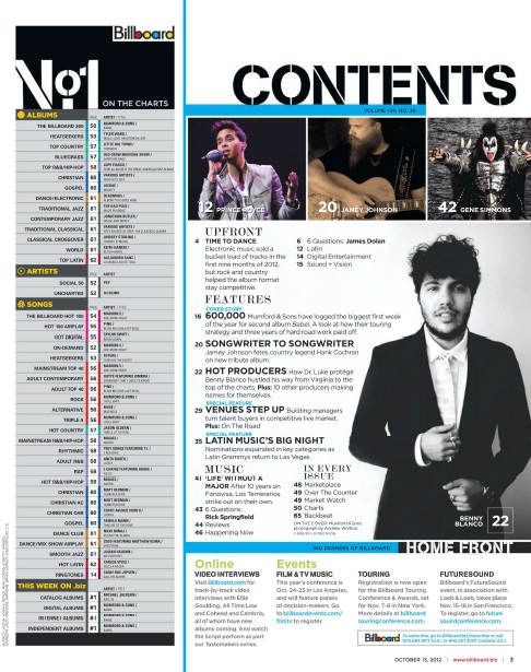
The contents heading is in a stencil font which to me adds another dimension to the page as it appears a bit out of place and is jagged in differentiation to the smooth fonts across the page.
As for the charts list, I have added a grey rectangle to bring the writing I will add out of the page and make it more visible to reader. In addition to this I have used a stencil cutout 'NO1' at the top, this uses the same technique as the contents header and allows for the reader to see at a glance what is underneath the heading.
Finally I have added the imagery, although they are the same , I have done this to see where I want the pictures on the page.
 For this image you can see that I have added the numbers for the pages. I have used a set of bright colour for the numbers, for some I have kept the colour the same as well as the numbers to suggest that particular content is on that one page. I have used the bright colours to add interest to the fairly bland grey background. In addition I have added the titles to each set of pages 'Songs' ETC, in yellow to link in with my masthead design. This categories are to allow the reader to find a specific part they might be looking for. Finally I have added in the pictures, I have relocated the imagery to to upper third of the page so the reader can see the artists quicker as the human eye reads left to right then down the page. In addition I have changed up the imagery, the first being Iggy England which links to the DPS and it shows the page number, The second is a Jessie J Concert at Eden which appeals the the target audience, and finally the third is a subject I took the picture of but didn't use in my 3 pages. However he would be spoke about later in the magazine.
Here Is my final page. I have added in the text to this page to finish of, parts include: Contents, Charts, online Information and competitions. The font is fairly small which links to billboard and is short and to the point which allows the reader to quickly find parts they like. In addition to this I have added in green and blue fonts to allow for even quicker location finding for the reader.
Overall, I am very pleased with the outcome as it fits my target audience well with the linking artists and new songs they are interested. But it still has more classical songs suggested that the older audience will like.
Front Cover Construction
 Here Is my first development screenshot for my front cover. As you can see I have located were my subject will go in the page and added in the masthead and Main Cover line. As for the subject I have located him in the centre with as much space as I could make around him. I had to flip him horizontally to achieve this as his arm was cover to much real estate on the right and the masthead was covering up the left half of the page. I also put the masthead in a unconventional place as they typically run across the top of the page. I have added it down the page to add some diversity to the page and my magazine.
 Here Is my second development, I have added the
cover line and website address. As for the cover
lines I have used a simple black and white serif font
which juxtaposes the bright yellow masthead. Each of the cover lines have a smalls yellow dot to link in with the colour palette of the page and therefore adds to the professional vibe. In addition to this I have brought the Masthead in front of my star vehicle to make the writing more visible to the reader. Underneath the masthead I have added the issue number and the website, although this is in a very small font the use of the masthead leading to it when you read it means that you will see the information after you see the masthead. This intern means later after looking at the magazine you will remember to look back their to see what the website was called or what magazine you will need to buy next.

Rough Pages


Here are two of my front covers I started to create before realising I either didn't like them or I changed my pictures. For the female front cover I got the layout set, however after realising I had a male star vehicle I thought that she would be better suited on the Double Page Spread instead. One reason behind this is because the female had to be cut out to fit on the page with enough writing space. Another problem was that I had already seen magazines with a double page spread with a women posing like this and I had started to plan the content that would go on the page. Therefore If I had used it on the front cover the story couldn't of been used which would of slowed me down.
As for the other version, I believed the background colour where to dark and opposing and didn't flow in a professional manner. In addition my star vehicle had a part of his arm cut out which I previously said would flaw the image. To fix this I will horizontally flip the image to allow for more writing space as it would be on the opposite side of the masthead.
After working out flaws in these, I believe my Final versions will be much better quality as their has been evident progression.
Article Copy
“At school, life was normal for me, meeting friends, activities and of course homework. I had no intention to leave school for University or to study in higher education, the only hobby I was interested in was singing. Like many girls in my school, I had a karaoke machine at home to keep me interested in my free time. Although I knew I wasn't very good, I still carried on like I was singing to masses at concerts. As expected my music passion kept with me through school with singing lessons and band practice, which I was the lead singer of. However this wasn't going to get me any where, sitting in a group of ordinary people wont help, instead I knew I needed to get my self noticed for something unique. Unfortunately popularity and fame wasn't a subject at the time.”
“ The way I got out of my skin and showed uniqueness was through YouTube. I believed that if I got out of my school band and went solo, I might get noticed. YouTube video creators had just started to become well known and YouTube famous with different styles of videos. However I noticed that not all categories had been covered, only videos to do with: Makeup, Gaming and technology where popular whereas singing wasn't typically on there. After realising I could do singing, I started a YouTube channel (The singing Iggy). Not a very professional name, but I didn't believe I was going to get anywhere. Contrary to believe my singing videos where popular, reaching anywhere from 1000 views to even 10,000. This was unbelievable to me and my family, Uploading a video a day of me singing in my lounge or even in public lead me to grow my channel to match over YouTube stars. Although I didn't become famous in a day, I did reach the goal from the start to be noticed by others.
“ After reaching my goal on youtube I knew that maybe I had some skill in me. Therefore I looked on a plethora of sites online to see if their were any record labels. However, they were all for high achieving individuals that have fame to their name instead of youtube subscribers. Although it seemed impossible I emailed any company that seemed lower down on the requirements for a label. After no avail for a whole month, I realised that my dreams might not come true. However, upon checking youtube I had seen a notification on my channel. I checked the notification and their it was, an email from CheapThrills record label. They had said that although my following wasn't huge my skill and vocals were impeccable, therefore they said I have a chance to get a Record Label if I came in for a interview and live performance. After a successful performance in London they took me on, after a few popular records I went on to receive a variety of emails from high hitting record companies. In short Cheap record labels are worth It.”
Wednesday, 3 February 2016
Photoshoot Review
Overall the photoshoot went fairly well and I have come out with some reasonable images that I can use on my magazine. After taking the pictures and seeing them back on the computer I can tell that the white background is easier to deal with and the detail is better compared to the black background. I believe this is due to me not having to over expose the image like I had to with the other background to gain more definition. If I were to do this photoshoot again I would use the white background for all the photos and also I would not physically crop the image when framing it. Although Knowing I could crop the RAW images on the computer I still framed the photo with the camera the match the image I was basing it of. This meant that if for some reason the image didn't fit into the magazine where I wanted it then the options for where it could go would be limited.
Another problem that occurred in the photoshoot was time, this restriction meant I only got one picture of each pose. Meaning that the photos I had where the only ones I could use and If the persons eyes where closed then the image would be rubbish. With the Female photoshoot I managed to get two photos, although not the same pose they were the same person. From here I realised that One pose I preferred the face whereas the other I preferred the Body, therefore I will edit the face to the other picture to perfect it.
Another problem that occurred in the photoshoot was time, this restriction meant I only got one picture of each pose. Meaning that the photos I had where the only ones I could use and If the persons eyes where closed then the image would be rubbish. With the Female photoshoot I managed to get two photos, although not the same pose they were the same person. From here I realised that One pose I preferred the face whereas the other I preferred the Body, therefore I will edit the face to the other picture to perfect it.
House Style Mood Board

I have chosen to use a more subtle colour palette with only a few vibrant colours on my double page spread. The reasoning behind these vibrant colours is due to the artist being very darkly dressed so I needed a contrasting colour scheme. In addition to the colour palette you can see some examples of what my pages might look like, I have chosen picture with a medium shot and who are in a smart attire to link to my target audience. Furthermore I will try to use techniques like bokeh and lighting techniques like some of these to connote a more professional vibe.
Sunday, 24 January 2016
Photos Edited
I am pleased to say that I have needed limited editing to my images (apart from airbrushing) and in fact I have not edited any picture on my contents page. As for the Front Cover (Boy) I only needed to flip the image horizontally, the reason for this was because I had my masthead on the left so if I wanted to maximise cover lines I would struggle with the arm in the way.
As for the DPS, I edited a few parts to make the image more appealing. Firstly I took the head of another photo of my star vehicle as I believed it was more interesting and provocative as she was aiming her face down which looked more serious. Thus, appealing to my target audience as she will be looked up to more. Finally I added nail varnish to the nails which had been chipped, this allowed for a more professional photo as it looks like it has been planned prior to the shoot.


Thursday, 21 January 2016
Photoshoot
Here are all of the fesable photos that I came out with on my photoshoot, however I believe I needed to plan my time more effectively to allow for more pictures and of a higher quality.
After a few photos and seeing others taking pictures I realised I needed a white background instead of the black one as this reduce definition in the pictures and didn't look as appealing compared to the white background. In addition to backgrounds I learnt about lighting and camera work, such things as intensity of the light or the ISO of the camera allowed for changes on the lighting on the subject or how crisp the image was. Little things like this kept my images to a reasonably high standard and therefore will help when making my pages.
So after taking this selection of photos I believe if I had planned who I would like to take the pictures of there attire and also when I took the photos then my outcome of photos would have been of a much higher standard. In addition the higher quality of images would have benefited my magazine pages.


Monday, 11 January 2016
Masthead Design

Here are some Mastheads that popular music magazines have used. The reason I have chosen these Is due to the fact they are all very simple and not to harsh to the eye. By this I mean that simple techniques have been used to give a effective outcome without much work. I feel that if I can create a successful Masthead then it will appeal better to my target audience, thus meaning it might sell more copies.
After looking at a few Mastheads I have decided that I will create a Masthead much like Billboards but I will use a different font to make it mine.
My Masthead- As you can see I have put my name of magazine (Unplugged) onto a font website and I have chosen this particular font. I will hopefully use the same font or an alternate that is fairly similar. The reason I like this font is due to the smooth rounded edges which isn't harsh for the older audience whilst it still keeps enough style for my younger audience. In addition I could use a colour on the gaps in the letters to look more like Billboards Font.
Feedback: For this I have asked people within my class and also my parents. This allowed for a wider age range of people to help fit my target audience. From both sets of people there feedback was positive with little to no improvements. Ben- "I really like the modern feel and the simplicity you have gone for, therefore I believe It will match your target audience well."
Parent- "I believe the Masthead is very professional and looks very much like a real music magazine, also if this would be on a Magazine I would be more interested than other boring Mastheads."
Thursday, 7 January 2016
Photo Planning


For my front cover, I am going to use picture that are similar to these. These pictures are mid shots and wide shots. However they aim in the picture to only uses the body of the person an a limited background. I will use the same technique to get a picture fairly similar, In addition like I said in my Artist profile I might use a different ethnicity like the third one. I will want to use a similar colour palette to these images, although the vary I will choose to to either or.(Bright/subtle)
As for the pose etc, this will be fairly sensible for my front cover and will not relate to much to music, by this I mean I wont use the stereotypical guitar or microphone to show of the music genre. This technique I see as being poorly executed and un professional as the photographer has to use props to show what the image is.
The Double page spread will be quite different from the Front cover in the sense it will be covering two pages and their will be a lot of background to allow for text. This means that for my DPS I will have to choose a good location to shoot or change the background in photoshop to fit the style of the magazine. If I find the correct shoot location I could use a sensible picture with smart attire with a more rustic, ruin like background. However if unsuccessful I will use a more modern style image which has a more vibrant background of a single colour and the outfit will match the style.From here I can use the other image that I believe wont suit the DPS and use this on the contents page as the main image.
For my Contents page the pictures will be less noticeable so therefore wont be needing as much attention, the images on their will be concert picture and other images that relate to the music theme and might have links with the topics in the pages to come.
These images are some to inspire me for my photoshoot and will be a wide shot to capture the person and the surrounding to cover the two pages that the DPS requires.


Main Artist Profile
I am planning to use either two of the same artists within my magazine or I will use more variation and use different artists throughout. The benefit I believe to doing different artists is the fact that I will be aiming my magazine at the wider audience I am aiming for and also keep people interested in each magazine variant. Meaning that if the Front cover was the same as the DPS the audience would then know without looking through the book what the main topic is about on the DPS, therefore they might not purchase the book.
As for the Subject of my pictures I am planning to use 16-20 year old people who could be either male or female. Although I might not be able the find a person to fit this range, I will still make them look smart and make the picture convey the age range I am aiming for. The ethnicity will white British as most pop magazine have British people within there magazines. In addition the smart dressed people I will also use more modern and up to date artists on my DPS for example. This will show variation in my magazine.
 This picture shows Adam Lambert who is fairly popular in America, however the reason I chose this is because it shows how lighting, background and the attire can depict the mood and style of the picture, I will use similar techniques to make my picture follow the nature of my magazine.
Title And Font Notes
Font Notes:
For my font I will use a large Sans-Serif font which covers the majority of the page and will be the biggest font throughout the magazine. The font I will use will be Arial or LL Brown, this I believe are boring they do show the style of my magazine and keep the clean look I am going for. In addition to this I may decide to use a more unique font for the DPS such as Stencil as this will keep a high appeal to make the magazine more successful.


Title Notes:
As for the name of my magazine I researched through the top magazine publishers and all of there magazines they have connections with and found out what the mastheads tended to be. As a result I found out that most magazine titles/mastheads are short/catchy and can link to the genre or topic in mind such as music. After my research I am going to use the title/name ' Unplugged', this I believe links very well to the music category and is still just inside the length of most mastheads.
My double page spread title is "How I became Famous", I believe this is a very good title due to a big audience like to know the personal side of famous people as they want to be like them one day. For this reason I have titled it to do with how my star vehicle became famous and therefore describing to people the way they could become famous.


This Image shows how the subjects name is in Serif font whereas the important information and cover lines are in a Sans Serif font, like described above. I will hopefully use a mixture of fonts styles like billboard have in there magazines.
Initial Ideas And Institution
For my magazine I have decided to use 'Unplugged' as my title, this is due to the professional nature it takes on and the short catchy style. Furthermore It matches with the music category in the sense that cables are unplugged. This Masthead will be a Big font size and will be Sans-Serif, This will match typical music magazines such as Billboard.
As for content, I will use a range of pop songs/ artists that are either throwback style or the most recent songs/artists that have been spoken about. As for these artists I will incorporate American and English artists to appeal to the wider audience I aimed for. Following my survey results I will use a majority of pictures and artists surrounded by information that is relevant. This information could be personal life, gossip, tours and interviews etc.
DPS: As for this I will use a very well known artist that could be the same as the front cover or another artist to add variation to the magazine. This DPS will have further more detailed information about their personal life, fame stories and much more, whilst keeping it professional and neat to appeal to my target audience. Within my survey my audience chose to have more subtle colours, this connotes that the theme of my pictures will be smarter and less vibrant. The colour palette will have a majority of darker colours whilst keeping vibrant colours for mastheads etc. This follows on from the two Billboard magazine I am basing mine on.
Institution:
Prometheus Global Media will be my chosen publisher for my magazine due to their fame and use within Billboard who are the magazine style I am basing mine of.
Sunday, 3 January 2016
Sub Genre Codes and Conventions
Front cover:
- Singular image with the artist who is the main subject of the magazine.
- New trending artists who have a high popularity.
- Serif Masthead at the top of the page in a big bold font case, this can be either in the centre or to the left half of the page.
- Following from the Masthead the cover lines will be the second largest font on the page in a very clear sentence case.
- Colour palette will be set by the attire of the subject in the image, and will follow this throughout the magazine.
- The font colour will follow this palette with colours that are easily readable and professional.
- Small print, price,date and issue number if applicable will be in a corner of the magazine in a small (5-9ppt) font that is just readable.
Contents page:
- 2-4 images all relating to the contents of the magazine, usually 2-3 of these are of a smaller size with a more major set/ singular image which could relate to the front cover image.
- Content of the page includes: images of artists that are relevant, topics in magazine, major page links to interesting topics and drama etc.
- Small sentence case small font which will be a sans-serif font to make it more professional.
- Again the font colour will be professional and use a black/white colour palette.
Double Page Spread:
- One main image that is either on the left or right page, however a singular image can cover the two pages with the image being planned so the page fold wont effect the image.
- The headline differs in the way that it is only on one page to make it easier to read and cant be folded in the centre.
- Subheading will be of a small font size just underneath the heading so people can understand what it links to.
- The heading and the subheading will be both serif and sans-serif depending on the design.
- As for the article font it will be a very small size of 9ppt a as these magazines attract people via the images.
- The colour palette will be similar to the contents page and will be a black/ white or a colour that fits with the design for the rest of the page.
- The byline will be in a very small font underneath the heading for the specific article.
- As for pull quotes these will have a font size in between the article size and subheading size, this can be in a different colour to make it even more noticeable.
Subscribe to:
Comments (Atom)